Vizster Visualizing Online Social Networks Jeffrey Heer – jheer@cs.berkeley.edu Professor Marti Hearst InfoSys 247 – Information Visualization University of California, Berkeley Spring Semester, 2004 IntroductionVizster is an interactive visualization tool for online social networks, allowing exploration of the community structure of social networking services such as friendster.com [4], tribe.net [12], and orkut [10]. Such services provide means by which users can publicly articulate their mutual "friendship" in the form of friendship links, forming an undirected graph in which users are the nodes and friendship links are the edges. These services also allow users to describe themselves in a profile, including attributes such as age, marital status, sexual orientation, and various interests. These services profess any number of goals, ranging from supporting dating and creating communities of shared interest to facilitating new business connections. Newman provides a wonderful overview of the statistical properties of such networks [9] and boyd describes emergent social phenomena surrounding social networking services [2]. Vizster provides a visualization of such services, providing an interactive sociogram for exploring the links between network members. In addition to visualizing "friendship" linkages, Vizster supports a range of exploratory search features, providing visualization of the rich profile data characteristic of these services, features which traditional sociograms [3] are not designed to communicate. The current application visualizes a "snowball" sample of the popular friendster [4] social networking service, encompassing over 1.5 million profiles and the linkages between them, roughly a quarter of active friendster users at the time of writing. Vizster currently limits itself to ego-centric social networks, or network views centered on a single individual and her direct linkages. Though this prevents viewing of the higher-level structure of the network, this compromise allows the interface to maintain real-time interaction and animation while still providing insight into the community structure of the service. Additionally, both Milgram's classic small-world experiment [7] and a more recent investigation by Adamic et al. [1] argue that local cues are sufficient for efficient navigation of such networks. DataThe social network data being visualized is the structure and content of friendster.com [4], the most popular online social networking service. A database of over 1.5 million profiles was constructed by running a web crawler on the friendster service over the period of October 2003 to February 2004. The crawl proceeded via a breadth first search of friendship links, collecting a "snowball" sample of user's profiles and friendship linkages. This crawl was seeded at three different accounts in the system, with all three owners consenting to the use of their account towards this purpose. The crawler first authenticates itself to the friendster web site, and then begins requesting users' profile pages and friendship links, parsing the HTML returned by the service and adding newly discovered users to a crawling queue. In addition to friendship linkage, the database contains the profile data for each crawled user. The following table describes the data attributes available in these profiles. Users can optionally leave fields blank, so the total available data can vary from user to user.
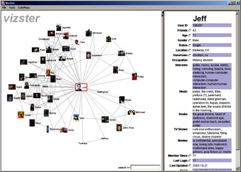
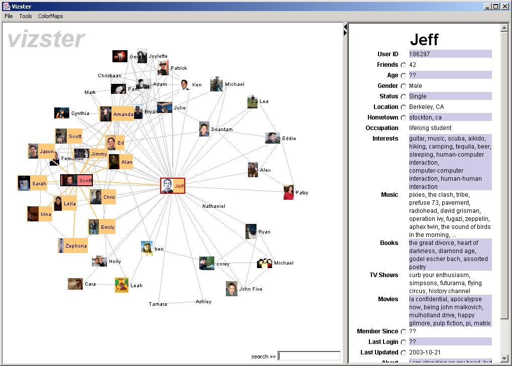
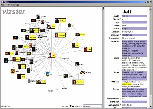
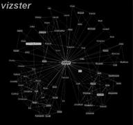
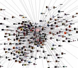
VisualizationThe basic Vizster visualization is shown below in Figure 1. After logging into the system, an ego-centric social network is presented, one central person being placed in the center of the display, with their friends placed around them. Individual nodes include the name of the person and a picture, if available. Links between friends are also shown, helping to delineate the various communities in which the central person is a member. Along the right edge of the display is a collapsible profile view, presenting all the attributes in a person's friendster profile.
Layout is performed by a physics simulation in which nodes exert anti-gravity upon each other to enforce space for each node, edges act as a springs pulling connected nodes closer to one another, and drag forces are used to prevent objects from flying wildly about. These forces are updated for each interactive time step; item position and velocity are determined by integrating these forces over the time step, using the 4th order Runge-Kutta method [15]. The central node is anchored in place, so the visualization does not unduly drift around.
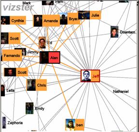
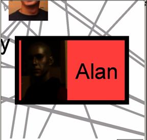
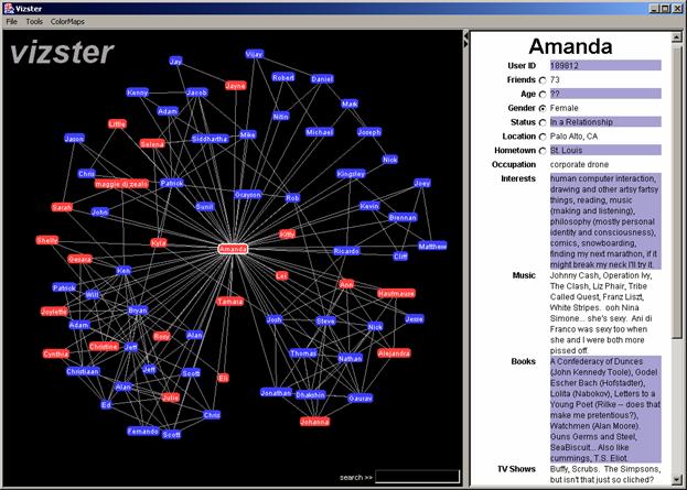
Interaction with the visualization is conducted primarily with the mouse. When the mouse passes over a node, the node is colored red and connected friends are highlighted, facilitating exploration of friendship linkages (see Figure 2). Clicking a node causes the corresponding profile to display in the profile panel. Such clicked nodes are visually distinguished using a red outline and red text. Dragging a node allows the user to reposition items, subject to the constraints of the force simulation. Double clicking a node makes it the new center of the display. In response, the node smoothly animates to the center of the display and the corresponding friends and linkages are asynchronously loaded from the database. Users can additionally use panning and zooming to further explore the display. Dragging the mouse on the background using the left mouse button initiates a pan, moving the display. Holding the right mouse button and moving the mouse up or down initiates zooming out and zooming in, respectively (see Figure 3). The application supports semantic zooming [11], or changing the appearance of nodes in response to the current zoom level. Currently this is quite subtle, as the visualization switches the rendering components to simply draw a higher-resolution version of a friend's picture when the scale is greater than twice the initial value. Updating nodes to include profile data when zoomed in was also considered, but proved more annoying than helpful, especially given the constant availability of the profile panel on the right side of the display.
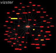
Finally, the basic Vizster interface also supports keyword search over the visible profiles, shown in Figure 4. As users type search queries in the box at the bottom of the display, matching nodes immediately highlight in yellow and text matches are highlighted in the profile panel. The search query is conducted over all the available profile attributes, and is computed efficiently using a backing trie data structure [13], which maintains a prefix-tree of the text in the attribute values for all currently visualized profiles. As profiles enter or leave the visualization they are appropriately added or removed from the trie data structure.
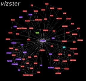
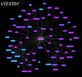
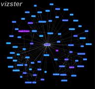
Comparison ModeIn addition to the basic browsing mode described above, Vizster also supports a comparison mode, featuring direct visualization of various profile attributes. The background of the visualization switches to black, and node color is used to communicate the values for the selected profile attribute. Profile attributes available for visualization have a radio button next to them in the profile panel. Clicking one of these radio buttons or its adjacent label causes the interface to switch into comparison mode for that particular attribute. For example, Figure 5 depicts Vizster showing the genders on all nodes (Females are shown in pink, Males are shown in blue). Clicking on an already-selected radio button disables comparison mode for that attribute, returning the visualization to the normal browsing mode.
Currently supported attributes include the number of friends, age, gender, relationship status, last login date, length of friendster membership, and when the profile data was downloaded. This encompasses both nominal (i.e. category) variables as well as quantitative (numerical) data. Figure 6 shows Vizster visualizing relationship status and last login, respectively. The nominal categories of gender and relationship status are visualized using pre-defined color maps, which assign unique colors to each unique attribute value. Quantitative variables such as number of friends and age are visualized along a color spectrum, provided by the color maps discussed in the next paragraph and shown in Figure 7. Dates are also visualized using these color maps. Both last login times and membership duration are visualized as relative values: the date value is subtracted from the time since the profile was last downloaded and then the values are normalized. The time since the last profile download is visualized by comparing against the current time and normalizing against a full year, providing a visual indicator of how "stale" the currently visualized data is.
To assign colors to quantitative data, Vizster currently provides three choices of color maps, all shown in Figure 7: a grayscale map, a "hot" map moving from red to yellow, and a "cool" map moving from light blue to dark purple. The hot map is particularly good at finding high-valued items, while the cool map more clearly accentuates low-valued items, facilitating different analyses. These maps can be selected using keyboard shortcuts or by using a drop-down menu.
ResultsInitial results from the Vizster interface are encouraging. The layout used has proven effective at helping reveal community structure, and the search and comparison features uncover non-topological features of the data. The visualization has also met performance requirements, allowing exploration of massive networks while supporting real-time interaction and animation. Still, as outlined below in the future work section, there are many other useful features that could be introduced. User studies and interviews with both friendster users and social networking researchers would also prove invaluable for unearthing needed features and guiding further design. ToolsThe crawler used to collect profiles was written using the Java programming language and the HTTPClient library for network connections. A MySQL database is used to store data collected during the crawl. The visualization was built using prefuse [6], a user interface toolkit for interactive information visualization written in Java using the Java2D graphics library. prefuse provided database connectivity, graph layout, animation support, and integrated search, allowing the basic visualization to be constructed in less than two days. The supporting user interface (i.e., profile display, menus, and search box) was created using the Java Swing user interface toolkit. The bulk of the programming work involved building and wiring up these user interface components, encompassing a few days of programming and testing. Future WorkThere are some other basic features that would be worth introducing. Notably, the crawler could be directly integrated into the visualization software, allowing users to visualize the current state of their friendster environment. The user experience might be hampered, however, by the dependence on friendster's server performance. A hybrid solution that leverages both the crawler and a database may prove to be the best solution. It might also be useful to visualize multiple attributes at one. This could be accomplished by using multiple retinal variables (e.g., using shape in addition to color), or by following the small multiples approach of [14], simultaneously showing multiple displays to provide comparisons across attributes. Another feature worth considering is allowing users to create and label communities of users, allowing users to track various community members across changes of focus. Finally, additional user interface features are called for, including a back button, bookmarks for profiles of interest, and dynamic query filters for visualized profiles. There are many promising avenues for future work. One such avenue is to provide more flexibility and scope in the segment of the network being visualized. One possibility is to allow selection of multiple focus profiles and then visualizing the paths between them. It may also be useful to show second- and third-order connections for a focus. However, this raises severe scalability issues, as each level includes exponentially more users. A very useful feature to add in the future would be more powerful filtering and selection mechanisms. For example, using dynamic queries to control node visibility and allowing users to manually group nodes into user-defined communities that can be treated in aggregate. Another avenue for future work is to incorporate more sophisticated analyses into the visualization. Algorithms for automatically identifying community structure [5,8] could accelerate linkage analyses. Furthermore, additional comparison modes for profile attributes such as location and interests would be of great help. One could imagine a system that computes distances between a focal user and her friends and visualizes that quantity. Additionally, one could create profile vectors for different user interests, either using straightforward information retrieval techniques (e.g., TF.IDF: term frequency by inverse document frequency weightings) or higher level analyses (e.g., genre analysis), and them compare these vectors to visualize similarities between user interests. References
1. Adamic, L. and E. Adar, How to Search a Social Network. Technical Report, Information Dynamics Laboratory, HP Labs, Palo Alto 2003. |