\Large Characterizing Mobility and Network Usage in a Corporate Wireless Local-Area Network

Characterizing Mobility and Network Usage in a Corporate Wireless Local-Area Network

Magdalena Balazinska
MIT Laboratory for Computer Science
mbalazin@lcs.mit.edu

Paul Castro
IBM T.J. Watson Research Center
pcastro@us.ibm.com


Data: The anonymized data along with all the documentation is available through Crawdad.

Disclaimer: The authors do not provide any warranty what so ever ;-)
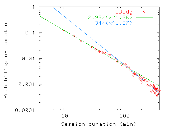

Below is the content of our paper which will appear at MobiSys 2003. You can also read it in pdf or in ps formats. Thank you for your interest.

Abstract

Wireless local-area networks are becoming increasingly popular. They are commonplace on university campuses and inside corporations, and they have started to appear in public areas [17]. It is thus becoming increasingly important to understand user mobility patterns and network usage characteristics on wireless networks. Such an understanding would guide the design of applications geared toward mobile environments (e.g., pervasive computing applications), would help improve simulation tools by providing a more representative workload and better user mobility models, and could result in a more effective deployment of wireless network components.
Several studies have recently been performed on wireless university campus networks and public networks. In this paper, we complement previous research by presenting results from a four week trace collected in a large corporate environment. We study user mobility patterns and introduce new metrics to model user mobility. We also analyze user and load distribution across access points. We compare our results with those from previous studies to extract and explain several network usage and mobility characteristics.
We find that average user transfer-rates follow a power law. Load is unevenly distributed across access points and is influenced more by which users are present than by the number of users. We model user mobility with persistence and prevalence. Persistence reflects session durations whereas prevalence reflects the frequency with which users visit various locations. We find that the probability distributions of both measures follow power laws.

1  Introduction

Several recent studies characterize the usage of various wireless networks [3,8,9,10,15,16]. Tang and Baker [15] focused on a university building and traced the activity of 74 users over 12 weeks. Kotz and Essien [8,9] studied a university campus network with 1706 users scattered through 161 buildings with a total of 476 access points. Balachandran et al. [3] examined usage of a wireless network in a large auditorium during a three day conference. Tang and Baker [16] also studied the Metricom metropolitan-area packet radio wireless network, a public network with approximately 25,000 radios. Lai et al. [10] analyzed a combined wireless and wired network, but that study was limited to only eight users.
Each study presents patterns of user mobility and network usage characteristics for one particular domain. In this paper, we complement these studies by presenting results from a four week trace gathered on a corporate wireless local-area network (WLAN). Our trace presents the activity of 1366 users. We use our trace as well as results from previous research to extract common characteristics of WLAN usage and to highlight and explain usage differences. We focus on population characteristics, load distribution across access points (APs), user level of activity, and user mobility.
We find that variations in the number of wireless users over time closely follow patterns of the underlying population, even though most users access the wireless network a fraction of days and a fraction of time. Hence, the number of users on a network might be adequately modeled by scaling down general population models.
Our study shows that there exist large personal differences in users' mobility as well as in their data transfer rates. Some users transfer over 1Mbps on average while others transfer less than 10Kbps on average. In general, we find that user average transfer rates follow a power law. The aggregate data transfer rate seen by an access point does not seem to depend on the number of users associated with the access point, but rather on which users are present. In each building, approximately 30% of access points owe over 40% of their load to the most active 10% of users on the network. Location of an access point also plays a role in the aggregate load it observes.
Users spend a large fraction of their time and long periods of time at a single location, which we call their home location. Interestingly, they do not reduce their network usage when moving away from that location and changing location more frequently. We model user mobility with persistence and prevalence. Persistence measures how long users stay continuously associated with the same access point and prevalence reflects how frequently users visit various locations. Our definitions are based on Paxson's definitions of "routing persistence" and "routing prevalence" in his study of Internet routing stability [13]. We find that the probability distributions of both measures follow power laws. We use prevalence metrics to classify users into different mobility categories. We find that 50% to 80% of users are occasionally or somewhat mobile: they spend most of their time at a single location, but periodically visit other locations.
Comparing our results with other studies, we find many similarities in mobility and network usage characteristics. We find that these characteristics are best explained by factors orthogonal to whether the network runs on a campus, in a corporation, or in a public environment. The main factors influencing network usage include personal differences between users and function of various locations (including scheduled events). The main differences in user mobility appear among locations serving as primary places of work and locations visited occasionally. The density of resources (classrooms, conference rooms), and differences between individual users also influence mobility significantly.
The rest of the paper is organized as follows. We first present the methodology used to gather our trace in Section 2. In Section 3, we describe the characteristics of our user population and contrast it with the population in previous studies. In Section 4, we describe load distribution across access points and analyze factors influencing access point load. Section 5 presents and compares user mobility characteristics in each environment. We also introduce metrics for describing these characteristics. In Section 6, we discuss how some of our findings may benefit network deployment, application design, and simulation of user mobility. We conclude in Section 7.

2  Methodology

The 802.11b wireless local-area network that we studied is spread throughout three large corporate buildings hosting computer science and electrical engineering research groups. The largest of the buildings, which we call LBldg, has 131 access points and is approximately 10 miles away from the other buildings. The other buildings, MBldg and SBldg, are adjacent to each other. They have 36 and 10 access points respectively. The placement of access points in buildings is based on geometry (one access points per corridor, for instance). Extra access points are placed in a few highly used rooms, such as a customer laboratory in SBldg.
The network is configured to run in infrastructure mode, in which wireless clients connect to the wired network through access points distributed in the environment. All 177 access points are Cisco Aironet 350s. We observed a total of 1366 unique MAC addresses. Laptops were by far the predominant devices on the network. We do not have information whether any other types of devices were used at all. We assume that each unique MAC address corresponds to a user, even though it is possible for a single user to have more than one MAC address or for users to trade cards with each other.
We used SNMP [4] to poll access points every 5 minutes, from Saturday, July 20th 2002 through Sunday, August 17th 2002. We chose 5 min intervals to ensure that our study would not affect access point performance. We collected information about the traffic going through each access point as well as about the list of users associated with each access point. For each user, we retrieved detailed information on the amount of data (bytes and packets) transferred, the error rates, the latest signal strength, and the latest signal quality. We polled all access points except three located in MBldg that did not respond to SNMP requests.
Due to a power failure, there is a one-hour hole in the data (07/30/2002 from 1pm to 2pm). For unknown reasons, we also have a few holes in the data gathered at a few of the access points during the evening and night of 08/08/2002. Due to periods where access points were heavily loaded, some sample intervals stretch to 10 min.
Users were not informed that the study was performed. The only sensitive information that we gathered were the MAC and IP addresses of network cards, as well as the names assigned to access points. To ensure user privacy, we anonymized all three types of information. We did not map access points to explicit locations or track individual users. We only present aggregate results.
All data from our trace is available for download at the following location: http://nms.lcs.mit.edu/~mbalazin/wireless/.

3  Wireless user population characteristics

We saw a total of 1366 distinct users in our four week trace: 796 users spent most of their time in LBldg building, 437 in MBldg, and 133 in SBldg. Figure 1 shows the total number of users present on the network every day of the trace. Figure 2 shows the number of users present on the network during different hours of a day on weekdays. We show the 10th, 50th, and 90th percentile values registered for each hour throughout the trace. For all three buildings, the patterns reflect the office environment and normal office work hours. We also note a slight reduction in the number of users around lunch time (Figure 2). However, since the reduction is small, we conclude that most users work through lunch or leave their laptops on while they eat, so the machine is "present" even if there is no activity. Also, some users stay late at night or leave their laptops on when they go home, since the number of wireless users is greater than zero during the night.
These patterns are similar to those found at university campus locations used for working (offices, libraries, academic buildings) [8,9,15]. They differ from on-campus locations such as dormitories [8,9] and public metropolitan networks [16], which users access both from work and from home. In these environments, peaks in the number of users appear during evening hours. There are also much lower reductions in the number of users on weekends. Small scale networks such as a single conference room [3] show much more variability in the number of users due to the impact of scheduled activities.
Therefore, daily and hourly patterns in numbers of wireless users on a network are closely tied to patterns in the underlying population. Differences appear not so much among public, academic, or corporate networks but among networks that cover usage at the work place, at home, or during a specific event.
./usersPerDay.png
Figure 1: Total number of wireless users in each building on each day of the trace. The trace starts on Saturday, July 20th 2002. The figure show patterns of a normal office work week.
./usersPerHour.png
Figure 2: Number of users per hour on weekdays. For each building, the 10th, 50th, and 90th percentile values for each hour are shown. The figure shows a strong pattern of regular office work day.
To further characterize the user population, Figure 3 presents the cumulative distribution of the number of days each user appeared in the trace. Each user was counted only in the distribution of the building where the user spent most of his or her time. The number of days that users are present varies greatly: only 12% to 25% of users are present more than 18 out of the 20 work days, whereas 22% to 38% of users appear only during one or two days. We suspect that the latter group are outside visitors mostly from other sites that the company has in the same metropolitan area. It is interesting to note that the great variety in the number of days that users are present does not influence the regular pattern shown in Figure 1. The presence of visitors and the absence of employees must therefore be uniformly distributed.
In terms of the fraction of days that users access the network, our distribution is similar to a single building on a university campus [15]. Compared with a whole campus [8,9] our trace has more users appearing only one or two days (visitors) and fewer users appearing more than 2/3 of the days. The higher uniformity of a campus wide distribution might be related to the fact that the study tracks many users for prolonged periods of time (i.e., students living on campus) and not only when they come to work in specific buildings.
Additionally, we computed the fraction of time users remain on the wireless network on days where they actually use it. We found that 50% of users remain connected 60% to 100% of the work day.
./daysPerUserCDF.png
Figure 3: Number of days users are present in the trace. The distribution is uneven at the edges. A large fraction of users (around 22% to 38%) appear only one or two days in the trace. Less than 10% of users come more often than the 20 work days of the trace and a fraction of these are laptops left in offices.

4  Load distribution across access points

In this section we examine load distribution across access points. According to current guidelines [1,5], access points should be distributed based on the physical aspects of buildings, the signal strength, and signal-to-noise ratios, as well as the number of users and their application mix. In this section, we examine how load is balanced across access points in real settings. We examine the user distribution, the total amount of data transferred, as well as the data transfer rates. We also examine factors influencing access point load.

4.1  Users

Figure 4 shows the fraction of users seen at each access point throughout the trace. A few access points see a small fraction of users: 10% of access points in LBldg see only 2.5% of all users who visited the building. Others see a greater fraction of users, some as much as 50%. Differences between buildings are partly explained by building sizes (LBldg is much larger than the other two) and numbers of access points: LBldg has 131 access points, MBldg has 36, and SBldg has only 10. Since approximately twice as many users visited LBldg as did MBldg, LBldg has a much smaller ratio of users to access points (around 7 versus 16 and 30 for MBldg and SBldg, respectively).
Figure 5 shows the maximum number of users simultaneously associated with each access point. Some access points see few simultaneous users: 40% of access points never see more than 10 users, while other access points see as many as 30 simultaneous users. Some of the access points with the highest numbers of simultaneously associated users correspond to large auditoriums and cafeterias.
University campuses [8,9,15] and large-scale public networks [16] also see great disparity in the average and maximum number of users handled by access points. This is not surprising as these values depend on the popularity of certain locations (auditoriums or cafeterias for example). Hence, except for small-scale networks [3], popularity differences appear in all environment studied. On a small scale, Balachandran et al. [3] find that users are distributed rather evenly across access points.
Given the regular work schedule of our corporate population, access points are idle (no user is associated with them) a large fraction of the time when weekends and nights are considered. However, access points are also idle some fraction of the time during normal working hours. Figure 6 shows the fraction of idle time for cumulative fractions of access points in each of the three buildings. Most access points are used almost all the time during a work week. For both MBldg and SBldg, 75% of access points are idle less than 10% of the time. However, 10% of the access points in LBldg are still idle over 75% of the time. On the university campus that Kotz and Essien study [8,9], over one third of access points are idle on a typical day. Hence, in all environments, good coverage requires deploying resources, even in locations where they are seldom used.
./totalUsersPerApCDF.png
Figure 4: Fraction of users seen at each access point throughout the whole trace. The fraction is computed with respect to users who visited each building. The figure shows a wide disparity across access points and across buildings.
./maxUsersPerApCDF.png
Figure 5: Maximum number of users ever simultaneously associated with each access point. The figure shows a wide disparity across access points.
./workTimeApIdleTimeCDF.png
Figure 6: Fraction of time that access points are idle during a normal work week (Monday-Friday, 9am to 6pm). Most access points are used almost all the time. However, a few access points are idle large fractions of time. The fraction of time was computed as the fraction of samples without any users.

4.2  Data transferred

Figure 7 shows the total amount of data forwarded through each access point during the trace. Access points are ordered by increasing amount of data they forwarded, and the cumulative fraction of access points is indicated for each amount. Due to space limitations, we only present results for traffic going from access points to wireless users. The graph for the opposite direction is similar, though with slightly lower values. The amount of data forwarded varies considerably across access points (from close to 0 up to 21GB1), indicating an uneven usage of resources.
./outBytesTransferredCDF.png
Figure 7: CDF of the amount of data transferred from each access point to wireless users over the duration of the trace. The figure shows an uneven usage of resources. Data from August 7th was ignored in this computation as all access-point counters were reset by a third party around 19:40 that day.
Figure 8 shows the average throughput of each access point. We define access point throughput or load as the total amount of bytes an access point forwards for any associated user in either direction over a given period of time. We computed these averages in two steps. For each access point, we first computed the average throughput for each sampling interval (interval between two consecutive polls of the same access point). We then computed the mean of these values. Figure 8 shows that much more data is transferred on average at some access points than others (with small errors on these averages, as shown in Figure 8(b)). We obtain similar graphs for the other two buildings. In the following sections, we discuss these throughput differences and examine factors that influence access point load.
./meanYKTAPThroughput.png ./stddevYKTAPThroughput.png
Figure 8: Average throughput for access points in LBldg. Only intervals with users were considered in averages. Access points are ordered by decreasing average.

4.2.1  Correlation between number of users and load

Figure 9 shows access point throughput for various numbers of associated users for MBldg. Throughputs were computed over individual polling intervals. The figure shows that little correlation exists between the number of users and access point throughput. For more than 14 users, the outliers (99th percentile) seem to decrease, but this is due to the smaller number of samples with so many users. We show the results for MBldg as access points saw highest numbers of simultaneously associated users most frequently. The graphs for the other buildings show even less correlation.
We computed the correlation coefficients for each building, and found 0.10, 0.20, and 0.15 for LBldg, MBldg, and SBldg respectively. For intervals where access point load exceeded 100Kbps, the number of users and the load are even less correlated (-0.14, 0.03, and -0.06). This phenomenon can be explained by noticing that most users are passive most of the time. When only passive users are present, increasing their number slightly increases the load. However, as soon as some users become active (i.e., start transferring large amounts of data), they drastically increase the average throughput and the influence of other users becomes insignificant.
We located a few access points that had the higher average transfer rates. They were our "dining conference room," laboratories, and conference rooms serving small meetings and teleconferences. These locations differ from most popular and crowded locations corresponding to cafeterias and auditoriums.
./correlUsersHAW1ThroughputPercentile.png
Figure 9: Throughputs measured at access points in MBldg for various numbers of associated users. 50th, 75th, and 99th percentile shown (only samples over 100Kbps were taken into account). The figure shows that little correlation exists between the two numbers.
Tang and Baker [15] find that: "Usually, the throughput as a whole increases as the number of users increases" (i.e., the total throughput through routers increases with the number of users). However, they find that: "the maximum throughput is achieved by a single user and application." Kotz and Essien [8,9] also notice little correlation between the number of users and the amount of traffic going through access points. They find the largest numbers of users at access points located in lecture halls, while most traffic comes from residences. However, it is not clear from their results whether the difference is attributable to the extra amount of time that users spend daily on the network at residences or their level of activity at these locations. Balachandran et al. [3] point towards the fact that: "load distribution [...] does not directly correlate to the number of users at an access point." Indeed, they find that peak load is not achieved when the maximum number of users are present. They also find that although the number of users is almost constant, load varies considerably over time. We confirm their conclusion on a larger scale. Additionally, Figure 9 shows that the number of users and the load are rather uncorrelated regardless of whether the load is high or not.
We conclude that offered load and number of users associated with an access points are weakly dependent in our environment, but also in the other environments studied.

4.2.2  Correlation between time of day and load

Figure 10 shows access point throughputs registered on various hours of the day. Throughputs were computed separately for each access point and each polling interval. The value was then associated with the hour of the first poll. The figure shows that little correlation exists between time and throughputs other than the fact that sometimes users are not present on the network, as shown earlier on Figure 2. The correlations coefficients between time of day and load are 0.016, 0.020, and 0.030 for LBldg, MBldg, and SBldg respectively. Similarly, in the trace presented by Balachandran et al. [3], the offered load oscillated between 0Mbps and 2Mbps as long as users were present on the network (during morning and afternoon sessions), showing little correlation between load and time of day.
Interestingly, in MBldg, we found that the few users who stay later at night generate only little activity whereas in LBldg, a lot of activity persists on the network until midnight (as shown on Figure 10). This shows a difference in the characteristics of the wireless population that did not appear when examining only the number of users on the network (Figure 2). Also, for all buildings, users detected around 3am to 6am were idle laptops left on in offices, since no activity was detected during these periods.
Even though load on access points is not directly correlated with the time of day, it may be influenced by specific events such as regularly scheduled meetings. For instance, for one of the access points, most peaks (above 2Mbps) occurred regularly between 12pm and 2pm. However, only few access points showed such clear patterns.
./correlTimeYKTThroughputPercentile.png
Figure 10: Throughputs (per polling interval) measured at every access points on each hour of the day on every workday in LBldg: 50th, 75th, and 99th percentile (of samples with values over 100Kbps) shown. No correlation seems to appear between throughput and hour of the day.

4.2.3  Personal user differences

Personal user differences are another factor influencing access point load: Some users are more active than others. To appreciate these differences, we compare the average rates at which users transfer data (in either direction). For any two consecutive polls, we compute the average transfer rate of each user who remained associated with the same access point over the interval. We then computed the average of all values for each user to get the overall average for that user.
We compare individual average traffic rates to determine personal differences in user's level of activity. Figure 11 shows a great disparity among users. Some users have quite high average traffic rates while others are hardly ever active. Except for passive users (transfer rate under 10Kbps), the average user transfer rates follow a power law distribution. For both MBldg and SBldg, we find a similarly shaped distribution with a 10Kbps threshold under which the distribution does not follow a power law anymore.
./meanYKTUserFactor.png
Figure 11: Distribution of average individual user transfer rates in LBldg. Averages follow a power law, except for passive users with average transfer rates under 10Kbps.
Whenever users with high network usage characteristics appear, an access point may expect its load to increase significantly. Figure 12 shows the fraction of the throughput due to users whose average data transfer rates are above 0.04Mbps. Access point indices correspond to those of Figure 8 (i.e., decreasing average access point throughput). These users represent only 10% of all users however they account for over 40% of the bandwidth usage at over 30% of access points. We obtain similar graphs for the other buildings. We also looked at users whose average rate was above 0.02Mbps. They represented 20% of all users, but they were responsible for over 40% of load at 60% of all access points.
Tang and Baker [15] find some differences among what they call user sub-communities (users whose offices are grouped around different access points). They find that, in general: "While the wings with most users (2b and 3b) also have the highest peak throughput, the users on the 3b wing attain that throughput more often." Other than this general finding, few conclusions are drawn in the other studies about personal user differences. We find that these differences are significant. Since our trace monitored 1366 users as they worked in offices, attended meetings, and relaxed in common areas, we believe that personal differences will extend to other environments as well.
./fractionFastYKTAPThroughput.png
Figure 12: In LBldg, fraction of total throughput attributable to users with average transfer rates higher than 0.04Mbps. Access point indices follow those in Figure 8 (decreasing average throughput).

4.2.4  Influence of access point location on load

Figure 12 shows that access points with high average throughputs (those at lower indices in the figure) owe slightly larger fractions of their throughputs to the most active users. Active users also use a large fraction of bandwidth at locations with little total activity. Therefore, the fact that some access points have much higher average transfer rates than others is also due to other factors than which users are present. In this section, we analyze the impact of access point location on its load by testing whether location influences users' level of activity.
To determine whether user's level of activity depends on location or not, we perform a one-way classification analysis of variance [6]. The factor that we are investigating is location. The hypothesis is that there is no effect of location on a user's data transfer rate. For each user, this analysis method compares the distribution of the rates achieved at each location visited (F-test [6]).
We only examine users who visited at least two locations and whose average transfer rate was above 10Kbps. For LBldg the classification is statistically significant for 27% of users. We reject the hypothesis of location neutrality in all these cases, and conclude that, for these users, location significantly affects transfer rate. Similarly, we obtain a significant result for 32% of users in MBldg and 23% of users in SBldg. We reject the hypothesis for all of them. Hence we conclude that user transfer rates are affected by the location.
From anecdotal evidence, we know that, in our corporation, during talks held in large auditoriums, users mostly check their email or browse the Web. During conference calls held in small rooms, users go over presentations and download attachments pertaining to the meeting, hence using much more bandwidth. We plan to investigate the relationships between applications and location in future work.
Other studies also seem to find some relationship between location and activity level, mostly because location determines the type of activities that users pursue. Balachandran et al. [3] never see peaks greater than 0.57Mbps for any user. Kotz and Essien [8,9] find that the daily throughput per MAC address varies greatly between buildings, with residences seeing much more traffic than social locations. They do not indicate whether the differences are attributable to higher throughputs or to the length of time that users spend in each location. However, they do find differences in the types of applications predominantly used in each campus building.

4.2.5  Access point peak throughput periods

In our data set, we observed many polling intervals where average access point throughputs exceeded 3Mbps. We observed extremely few intervals with 5Mbps or higher averages. Therefore, in this section, we present results for intervals averaging over 4Mbps. We call such intervals peak throughput periods or peaks. We find that peaks last short periods of time and seem highly correlated with location. However, the network we studied was well provisioned and did not seem to experience much overload.
Figure 13 shows the number of polling intervals (consecutive or not) where the average transfer rate exceeded 4Mbps for each of the 131 access points in LBldg. In the figure, access points are ordered by decreasing number of peaks. Some access points experience peak throughput periods quite often while the transfer rate at others never exceeds 4Mbps. A few of these peaks lasted over an hour, but 48% of them lasted only for one polling interval in both LBldg and MBldg. The fraction was 64% in SBldg. In [15], Tang and Baker found that in their network, throughputs greater than 3Mbps were due mostly to a single user rather than distributed across several users. They also found that some locations were seeing significantly more peaks than others.
We also looked at how often more than one access point experienced a period of high load. For LBldg, there were 188 events where load exceeded 3.5Mbps at some access point. 50 of these events happened at the same time or within a few minutes of one or two other events. However, since we do not track access point location, some of these simultaneous events are probably unrelated. Hence, most peaks affect a single access point at the time.
./perAPYKTFlashcrowd.png
Figure 13: Distribution of the number of high data transfer rate intervals across access points. Some access points see high transfer rates quite often while most access points never see high transfer rates (access points are ordered by decreasing number of peaks).
We conclude that individual user differences have a high impact on access point load: 20% of users account for 40% of the data transferred at over 60% of the access points. Access point location also influences load, but much less. Popular locations see many simultaneous users and a larger fraction of all users, but the number of users does not influence load significantly. Unpopular locations remain idle most of the time. Time of day influences the number of users present on the network, but it does not influence access point load significantly, even during the night. Finally, many network usage characteristics such as the uneven distribution of users and load across access points, and the differences in location popularity, are independent of whether the network is deployed on a university campus, a corporation or at a conference.

5  User mobility characteristics

In this section, we examine user mobility characteristics and compare our results with the characteristics found in the other studies. We assigned a home building to each user corresponding to the building where they spent most of their time.
For each building, Table 1 shows the fraction of users who visited only that building, either of the other buildings, or all buildings. Most wireless users stay within one building, but a significant fraction (20% to 45%) move between two or more buildings. This is mostly the case for MBldg and SBldg, located near each other. Only a small fraction (up to 11%) of users visit all three buildings. These mobility patterns are much more constrained than those found on a university campus [8,9] where the median user in their trace visited five buildings. The difference is due to a higher concentration of resources (libraries, conference rooms) within each of our corporate buildings. Also, many university users both work and live on campus and visit different campus locations for each type of activity.
LBldg MBldg SBldg
one bldg 81% 55% 72%
two bldgs 16% 34% 26%
three bldgs 3% 11% 2%
Table 1: Fraction of users who visited one, two or all three buildings. Each user is counted with the building where the user spent most of his or her time.
Figure 14 shows the number of access points each user visited during the trace. The figure shows cumulative fractions of users who visited increasing numbers of access point. We find that 50% of users in SBldg, MBldg, and LBldg visited respectively 3, 9, and 7 access points or fewer. These numbers include users who use their wireless cards only a few days in the trace. On the other hand, 50% of users visit between 7 and 40 access points, with one user visiting as many as 50. University campus users show even greater mobility disparities than corporate users: the median corporate user visits a similar number of access points as the median university user [8,9], but the tails of our distributions (Figure 14) are shorter. Hence, there might exist small differences between user populations, but the differences might also be due to the fact that Kotz and Essien [8,9] study many users while attending activities other than working.
./apPerUserCDF.png
Figure 14: Number of access points visited by users during the whole trace.
Figure 15 shows the distribution of the number of access points visited daily (50th, 75th, and 99th percentiles). The daily values are lower than the cumulative values presented in Figure 14, showing that users visit different locations on different days. On a daily basis, the least-mobile users (up to the 50th percentile) visit up to three access points in a single day. Most users (up to 75% of them) visit up to 3 or 5 access points, and the most-mobile 25% of users visit between 5 and 25 access points in a single day. As in our study, Tang and Baker [15] also find differences in user mobility, categorizing many as stationary, some as somewhat mobile, and a small fraction as highly mobile. Hence, in different environments there exist large personal differences in user mobility, with most users spending a large fraction of their time at one location.
./apPerUserPerDay.png
Figure 15: Distribution of number of access points visited by users each day of the trace. The 50th, 75th, and 99th percentiles are represented. Note that graphs for MBldg and SBldg are slightly offset along the x-axis to improve readability.

5.1  Home location and guest location

Since most users are stationary a large fraction of the time, we compare user behavior in the location where they spend most of their time - their home location - with their behavior in other locations - guest locations.
To determine each user's home location, we could simply identify the access point with which they are most frequently associated. However, visitors or users who use the Ethernet when working in their offices should not be assigned a home location. Therefore, we fix a threshold on the fraction of time that a user must spend with an access point for it to be considered the user's home location. We computed home locations for thresholds of 30%, 40% and 50%. With 30% or 40% thresholds, a few users who divided their time rather equally among various buildings ended-up with a home location in the wrong building. With a 50% threshold, 10% to 25% of users did not have a home location, but all home locations were within buildings where users spent most of their time. We therefore chose to use a 50% threshold to find user home locations. Figure 16 shows the cumulative distribution of the fraction of time spent by users at their home location. Users spend up to 100% of their time at their home location, with half the users spending at least 60% of their time there. Given the low daily user mobility found in the other studies, we expect users in other environments to show similar distributions of the amount of time spent at a single home location.
./fractionHome.png
Figure 16: Fraction of time that users spend at their home locations. The fraction of time was measured as the fraction of samples where the user was seen at its home location.
We find that the median user transfers around 20 MB in a single day at his or her home location which is similar to the amounts of data transferred by university users [8,9]. At guest locations, users transfer approximately half that amount. However, since, by definition, users spend a large fraction of time at home locations, time plays a leading role in this difference. Figure 17 shows average daily transfer rates for home and for guest users (computed as the total amount of data transferred by a user divided by the total amount of time the user spent associated with home or guest access points during that day). Median values are similar for both guest and home users, but outliers (90th percentile values) show higher activity at guest locations. Hence, mobility does not seem to have a negative impact on user transfer rates.
./homeRatePerUserPerDay.png ./guestRatePerUserPerDay.png
Figure 17: Average daily data transfer rates per user, at home (top) and at guest (bottom) locations. The 10th, 50th, and 90th percentiles are represented.

5.2  Prevalence

To better model the mobility of a user population or that of an individual user within the population, we compute two metrics: access-point prevalence in user traces and user persistence at various locations. These notions are motivated by Paxson's analogous definitions [13]. These two metrics characterize mobility patterns independently of the duration of the trace and independently of the amount of time that users spend on the network. We start by presenting prevalence metrics. We discuss persistence in the following section.
Access-point prevalence in a user's trace is the measure of the fraction of time that a user spends with a given access point. If a user visits an access point frequently or spends a lot of time at the access point, the prevalence of this access point in the user's trace will be high. Home locations therefore have high prevalence values whereas guest locations have lower prevalence values.
The prevalence distribution for a network is a matrix where each row corresponds to an access point and each column corresponds to a user, as illustrated in Figure 18. We compute one prevalence matrix for each building to compare mobility within each building. Figure 19 shows the probability distribution of prevalence values from the LBldg matrix. Zero-value prevalences have been discarded from the graph as most users visit only a few access point (so zero-value prevalences dominate). The graph shows that users visit a few access points frequently (prevalences higher than 50% have non-zero probabilities) while visiting most access points rarely (prevalences of 0% to 5% are frequent). More precisely, the prevalence probability distribution follows a power law with a low exponent as shown in the figure. We obtain almost identical graphs for MBldg (with the same power law). For SBldg, we find a significantly larger fraction of prevalences close to 1, pointing towards lower mobility within that building. Hence, for SBldg, we find that the distribution follows a power law only for prevalence metrics in the range [0,0.9]. The difference is most probably due to the smaller size of the building: there are only 10 access points in SBldg.
U1 U2 ... Un
AP1 Prev1,1 Prev2,1 ... Prevn,1
Ap2 Prev1,2 Prev2,2 ... Prevn,2
... ... ... ...
APk Prev1,k Prev2,k ... Prevn,k
Figure 18: Prevalence matrix for a network of n users and k access points.
./YKTPrevalenceDist.png
Figure 19: Probability distribution of prevalence values for LBldg. Zero valued prevalences are not counted. The other values are in bins of size 5%. The distribution follows a power law with a low exponent.
Given these distributions, for each building, we characterize each user with two numbers: the maximum prevalence and the median prevalence. For a given maximum prevalence, the median is inversely proportional to the mobility of the user. The more access points a user visits, the lower the median prevalence.
With these two measures, we categorize users into five groups as shown in Table 2. By increasing mobility, the categories are: stationary, occasionally mobile, regular, somewhat mobile, and highly mobile. Stationary users stay with a single access point almost all the time so their maximum prevalence is high and their median is equal to their maximum. Occasionally mobile users spend most of their time with a single access point and visit others infrequently. Their maximum prevalence is high, while their median prevalence is low. As the user spends less time with a single access point, their maximum prevalence decreases. We categorize these users as either somewhat mobile or highly mobile. Finally, regular users alternate regularly between a few access points so both their median and maximum prevalences are medium. In all three buildings, around 40% of users are only occasionally mobile. Few users, however, are totally stationary (around 10% for LBldg and MBldg). Users appear more stationary in SBldg, probably due to the small number of access points in the building (only 10). A considerable fraction of users (10% to 40%) is somewhat mobile, but only a few users are highly mobile.
Median Prevalence (Pmed)
Maximum Prevalence
(Pmax)
Low
Pmed ε [0,0.25)
Med
Pmed ε [0.25,0.50)
High
Pmed ε [0.50,1]
Low
Pmax ε [0,0.33)
highly mobile
(4%,6%,0%)
N/A N/A
Medium
Pmax ε [0.33,0.66)
somewhat mobile
(38%,29%,11%)
regular
(10%,11%,13%)
N/A
High
Pmax ε [0.66,1]
occ mobile
(39%,44%,44%)
N/A stationary
(9%,10%,32%)
Table 2: User categorization based on prevalence metrics. For each building, the fraction of users who belong to each category is indicated under the category name (LBldg, MBldg, and SBldg respectively).

5.3  Persistence

Prevalence has one major limitation: It does not take into account the amount of time users stay associated with access points. A user who spends a week with an access point and another week with another access point will have the same prevalence metrics as a user who continuously moves between two access points. To complement the prevalence metric, we compute user persistence at various locations. The persistence is the amount of time that a user stays associated with an access point before moving to another access point or leaving the network. Since we poll access points every 5 to 10 min, we see only visits longer than that interval.
Given our distinction between home and guest locations, we plot the probability distribution of persistence separately for each group (and for each building). Figure 20 shows the probability distribution of persistence values up to 400 min separated between home locations and guest locations. Both distributions follow power laws. For guest users, the exponents are higher indicating that shorter sessions are more frequent. Additionally, we note a knee in the probability distribution of guest users, which indicates two different trends in persistence value distributions. The knee appears around 100 min. After that threshold, the power law distribution becomes even steeper indicating that longer sessions become even rarer above that threshold. The two trends that appear may be explained as follows. Short sessions are due to users moving around, attending talks which last between 20 min and one hour, and also users taking breaks in common rest areas. Hence, for up to an hour, various session durations are registered. Longer sessions are mostly due to meetings that last between an hour and two hours but hardly ever take longer than that. We find an almost identical fit for both MBldg and SBldg distributions with a slightly higher exponent after the 100 min knee for MBldg and slightly different constants.
./guestYKTSessionDur.png ./homeYKTSessionDur.png
Figure 20: Probability distribution of persistence values up to 400 min for home (bottom) and for guest users (top) in LBldg. Above 400 min, the probability is close to negligible. Since our sampling interval is 5 min and often stretches slightly above that value, most persistence values up to 5 min are rounded up to the 5 min-10 min interval.
Balachandran et al. [3] find that user session durations follow a General Pareto Distribution with a shape parameter of 0.78. This is equivalent to a power law distribution with exponent 1.78 (i.e., [ 1/(x1.78)]). This distribution is closest to what we obtain for guest users, which is what we might expect since during a conference users are not at their normal home locations.
Finally, we compare each user's median persistence at home and at guest locations. Figure 21 shows the scatterplot obtained for LBldg. A few users have a home median persistence lower than a guest median persistence. These are mostly users regularly alternating among a few access points. In most cases, persistence at home is equal to, or even one or two orders of magnitude greater than, persistence at guest locations. For users without a home location, median persistence varies within the same range as for other users.
./YKTPerUserScat.png
Figure 21: Scatterplot of median guest and median home persistence values for users who visited LBldg. Users without a home location in LBldg are assigned a home median of 1 min so they are also represented on the graph. Home median persistence is almost always greater than guest median persistence, often by as much as one order of magnitude.
In conclusion, the primary characteristic of user mobility is that many users spend a large fraction of their time in a single location. They visit this location frequently and stay for long periods of time. When they move away, they do not reduce their data transfer rates, but they spend short periods of time at any location and they do not visit the same location frequently.

6  Discussion

In this section, we discuss possible applications of user mobility and network usage characteristics to wireless network deployment, to workload generation, and to application design.

6.1  Wireless network design and deployment

Several approaches recently introduced new algorithms to relieve "hot-spots" and dynamically balance load among access points. Cisco access points [7] balance load between each other (within an overlapping cell) using the number of users, their error rates, and signal strength. Balachandran et al. [2] improve load balancing by explicitly re-directing users to satisfy pre-negotiated bandwidth range service agreements. Balancing users across access points is important. As shown in Section 4.2.5, even in a well provisioned network, access points often experience periods of high demand lasting a few minutes. In our trace, most of these peaks affected a single access point at a time. Therefore, quickly load balancing users could often unload one or two heavily-loaded access points.
Our analysis provides further information that may be helpful in designing load balancing algorithms: a) we find high personal differences in network usage; b) users with high average transfer rates represent a small fraction of all users; and c) any access point sees only a small fraction of all users. Additionally, location seems to play some role in user's level of activity. Given these network usage characteristics, we propose that access points keep mobility and network usage figures for each moderately active client. They could then better react to overload because they would know how long associated users were likely to stay and what amount of resources they were likely to require. Of course, to protect user privacy, access points should neither make this data openly available nor communicate it to other access points.
For each associated user, access points already keep counters of bytes and packets transferred. For users transferring more than 2Mbps or 3Mbps, each access point could preserve a running average of data transferred as well as the user's peak transfer rates. Each access point could also preserve a running average of persistence values, updating them as follows every time a user de-associates from an access point: Puser,t = a* Puser,t-1 + (1-a) Duser, where Puser,t-1 is the previous average persistence for a user, Duser is the amount of time the user remained associated this time, and a Î [0,1] is a factor adjusting the importance of history over the latest value. The average transfer rate, Xuser,t, could be computed in a similar manner. In a situation of overload, an access point could choose to re-direct a user to another location if this user had a history of using a lot of resources (high X), but not staying very long (low P). The access point would not waste resources redirecting users that are always idle. It would also avoid re-directing users who stay with the access point for prolonged periods of time (perhaps those who have their office there).
Access point popularity is another useful metric for network deployment. To provide coverage, we find that some access points are deployed in locations where they are seldom used. These access points could self-tune to reduce their power consumption or increase their coverage (while decreasing maximum data rates). Additionally, access point could compute and compare user persistence and prevalence metrics to determine their relative popularity. Such relative popularity metrics, coupled with load metrics, would help system administrators determine the most appropriate locations for new access points. Ideally, system administrators want to deploy extra access points before users see performance degradation, so they need other metrics to determine where new access points should be added.

6.2  Refining workload generation

Several tools exist to simulate wireless networks [11,12,14]. They model characteristics of the wireless network quite accurately, but they require users to dynamically define the location of a node or to define trajectories. However, tools could use the concept of "home locations" as well as power law distributions for persistence and prevalence to simulate user mobility automatically. Persistence could serve to determine how long a user stays at a location on average, whereas prevalence could serve to determine which location the user visits.
Additionally, we find it reasonable to use scaled down population models to determine the number of users present on the simulated network at any point in time.

6.3  Guiding application design

Knowledge of network usage characteristics may also prove helpful in designing applications for mobile environments. For example, since users spend a large fraction of time at their home location the design of mobile systems might benefit from optimizations for this particular usage pattern. An application may, for example, keep information about each user at their home location.
Additionally, in all environments studied, most users visit only a few locations during a day, and spend a large fraction of their time at their home location before visiting other locations on subsequent days. This specific mobility pattern should also influence design decisions. For example, when synchronizing application data, it would be an appropriate design choice to designate the home location as the "master" replica.

7  Conclusion

In this paper, we presented the analysis of results from a four week trace gathered in a large corporate environment and showing the network usage of 1366 different users. Analyzing mobility and network usage, we find several characteristics, many of which are shared by users in other environments such as university campuses and public networks.
In spite of increasing popularity of wireless networks, the number of days each user appears on the network is highly variable among different users. However, the general patterns in the numbers of users per day and the number of users per hour follow a regular office schedule.
Load is unevenly distributed across access points. Some, located in popular areas such as large auditoriums, often see high numbers of users simultaneously associated with them (up to 30). Others, located in less visited areas, are usually idle. We find that the amount of traffic at an access point is weakly dependent on the number of users present or the time of day. Most traffic is due to a small fraction of active users: the most-active 10% of users are responsible for more than 40% of the data transferred at 30% of locations. Load is also somewhat related to access point location, as we find that location impacts user transfer rate significantly for 30% of active users. Additionally, user's average level of activity follows a power law distribution.
We introduce persistence and prevalence to characterize and classify user mobility. Probability distributions of both metrics follow power law distributions. Persistence at guest locations also has a higher exponent than persistence at home locations, clearly showing that users associate with access points longer when staying at their home locations. Using prevalence, users can be categorized into mostly stationary, occasionally mobile, regular, somewhat mobile, and highly mobile. We find that 50% to 80% of users fall into the occasionally and somewhat mobile categories. Finally, we find that mobility does not influence user level of activity on the network. However, most devices in our study were laptops; mobility results may become different as PDAs and other small devices become more popular.
We plan to repeat this study, using SNMP in combination with syslog and tcpdump as well as monitoring software on mobile devices. Our goal is to get more detailed information on network usage and develop more detailed models of both mobility and network usage.

Acknowledgmenents

We thank Apratim Purakayastha for his helpful suggestions throughout the project. We thank Drew Wyskida for helping us gain access to the access points. We gratefully acknowledge the help of David Kotz with SNMP and data collection scripts. We thank Hari Balakrishnan and Chuck Blake for their suggestions on result presentation and analysis. We also thank everyone who read and commented on draft versions of this paper.

References

[1]
B. Alexander and S. Snow. Preparing for wireless LANs: Secrets to successful wireless deployment. Packet Magazine. Cisco Systems. http://www.cisco.com/warp/public/784/packet/apr02/p36-cover.html, April 2002.
[2]
Anand Balachandran, Paramvir Bahl, and Geoffrey M. Voelker. Hot-spot congestion relief and user service guarantees in public-area wireless networks. In Proc. of the 4th IEEE Workshop on Mobile Computing Systems and Applications (WMCSA 2002). IEEE Computer Society, June 2002.
[3]
Anand Balachandran, Geoffrey M. Voelker, Paramvir Bahl, and P. Venkat Rangan. Characterizing user behavior and network performance in a public wireless LAN. In Proc. of ACM SIGMETRICS'02. ACM Press, June 2002.
[4]
J. Case, M. Fedor, M. Schoffstall, and J. Davin. RFC1157: A simple network management protocol (SNMP). http://ietf.org/rfc/rfc1157.txt?number=1157, 1990.
[5]
Alex Hills. Wireless Andrew. IEEE Spectrum, 36(6):49-53, June 1999.
[6]
William W. Hines and Douglas C. Montgomery. Probability and Statistics in Engineering and Management Science. Third Edition. John Wiley and Sons, 1990.
[7]
"Cisco Systems Inc.". Data sheet for Cisco Aironet 350 Series access points. http://www.cisco.com/warp/public/cc/pd/witc/ao350ap/prodlit/, July 2001.
[8]
David Kotz and Kobby Essien. Analysis of a campus-wide wireless network. In Proc. of the Eigth Annual Int. Conf. on Mobile Computing and Networking (MobiCom). ACM Press, September 2002.
[9]
David Kotz and Kobby Essien. Characterizing usage of a campus-wide wireless network. Technical Report TR2002-423, Dept. of Computer Science, Dartmouth College, March 2002.
[10]
Kevin Lai, Mema Roussopoulos, Diane Tang, Xinhua Zhao, and Mary Baker. Experiences with a mobile testbed. In Proc. of the Second International Conference on Worldwide Computing and its Applications (WWCA'98), March 1998.
[11]
ns-2. The Network Simulator. http://www.isi.edu/nsnam/ns/.
[12]
Inc. OPNET Technologies. OPNET Modeler. http://www.opnet.com/products/modeler/home.html, 2002.
[13]
Vern Paxson. End-to-end routing behavior in the internet. In Proc. of the ACM SIGCOMM Conference. ACM Press, August 1996.
[14]
Rice Monarch Project. http://www.monarch.cs.rice.edu/cmu-ns.html, 1999.
[15]
Diane Tang and Mary Baker. Analysis of a local-area wireless network. In Proc. of the Sixth Annual Int. Conf. on Mobile Computing and Networking (MobiCom). ACM Press, August 2000.
[16]
Diane Tang and Mary Baker. Analysis of a metropolitan-area wireless network. Wireless Networks, 8(2/3):107-120, 2002.
[17]
ZDNet News. 802.11 group looking for more 'hot spots'. http://zdnet.com.com/2100-1105-936659.html, June 2002.

Footnotes:

1Throughout the text, 1MB = 220 Bytes and 1 Mbps = 2-3 MBps


File translated from TEX by TTH, version 3.32.
On 19 Feb 2003, 19:06.