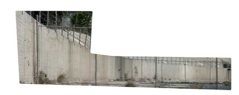
: Intelligent strobing visualization.
These visualizations clearly reduce the
jumbled overlap that can be present in fixed-frequency strobing.
At the same time, they do so at the expense of the timing information
present in the previous visualizations. Viewers found the
technique unnecessary for the Iron Giant sequence (
Figure 10), where the timing was deemed more
important than individual image clarity. In the Point Break
sequence (
Figure 9), viewers preferred the
intelligent strobing version to the fixed, but still expressed some
issues with timing: "It's definitely clearer that he's climbing and
more pleasing to watch, but you do kind of get the feeling that he
just hopped right up the fence."
With intelligent strobing, one can no longer rely on sprite spacing to
inform speed information. But what if we encode that information
using some other degree of freedom? One solution (
Figure 11) that we have begun to explore is using
transparency to reinject the lost timing information. Using the
same images, we now adjust each sprite's opacity based on how many
neighbors had to be removed. The running images stay relatively
transparent, whereas the climbing sprites get "burned" into the image,
giving the sense that more time was spent in that area, without
decreasing clarity.
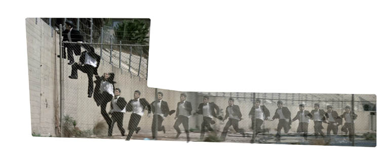 Figure 11
: Using
Transparency to encode lost timing information.
Video
Though intelligent strobing can reduce overlap in many sequences, there
are still many for which any kind of strobing is doomed to failure.
The following visualization (
Figure 12) depicts a
Paul Taylor
dance sequence.
Despite carefully choosing of keyframe poses, there is simply too
much overlap in the same area of the image to be comprehensible.
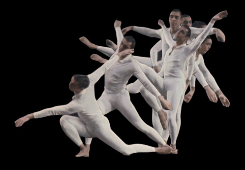 Figure 12
: Intelligent
strobing visualization with considerable overlap.
Video
Mobile sprites
We can further exploit the freedom of the digital domain if we relax the
constraint that sprites must remain in their original location. To avoid
overlap we simply move the images to space them further apart. In the
following visualizations (
Figure 13), we space the
images from right to left and vice versa:
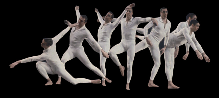
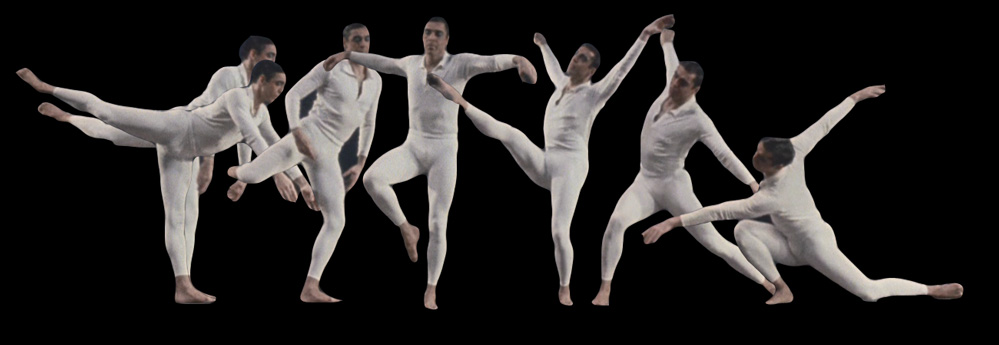 Figure 13
: Mobile sprite
visualizations, leftwards and rightwards.
Video
Each direction has its own
advantages. The motion of the character is generally leftwards,
making the composition of the first visualization more realistic and compact.
However, people are generally used to reading left to right,
making it more obvious in the second visualization in which pose the
character starts. Though the compositing of the sprites denotes
the ordering (newer images above older), at a glance the top visualization
can be easily be mistakenly read backwards.
In the same way that intelligent strobing loses some of the
temporal context, mobile sprites loses the spatial context. Viewers
found these visualizations vastly more understandable than the simple
strobing example (
Figure 12), but remarked that
without careful study, they seemed like two completely different motions:
clearly, much of the information is still being lost.
The following visualization (
Figure 14) depicts
another
dance sequence. The
motion of the character is generally left to right, but the overlap is
still distracting. The sequence is particularly suited
for the spacing technique (
Figure 15): we
can increase the left to right motion of the character, reducing overlap,
without losing a sense of the motion.
 Figure 14
: Intelligent strobing
visualization.
Video
 Figure 15
: Mobile sprite
version.
Video
Earlier, we used transparency to encode
a specific variable, namely a sprite's velocity. The human visual
system is adept at discerning overlapping translucent layers, and so
we can also use this in a more abstract sense to help deal with overlap.
This allows us to overload the same image real estate with several layers of
information. The following visualization (
Figure
16) is the same as the top visualization in
Figure
13, but the transparency of the sprites range from zero to fifty
percent and back to zero.
 Figure 16
: Leftward mobile
sprites with transparency visualization.
Video
Mobile sprites, described in this section,
can be seen as a midpoint in the continuum between strobing and
comic books, where the sprites are spaced so far
apart that they are in different images. Both methods lose the spatial
context of simple strobing, but this is less of an issue in comics, where
the lack of context is made explicit. In that way, one can avoid the false
illusion of directional movement that can be present in the above examples.
NEXT: Comics
