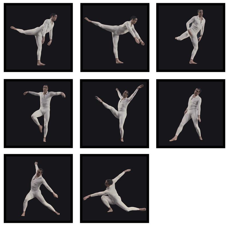
Figure 17: Comic strip visualization. Video
The comic is a well established medium
for depicting motion on a page. It has the advantage that it can work
for both fast-moving and stationary motion, without the overlap issues
present in the strobing techniques described above. Unlike the general
mobile sprite technique, comics have a predefined order in which they
are read, reducing ambiguity. The framing can be used to help associate
one panel with another: in the sequence above, the character is anchored
clearly in the center of each frame.
In creating simple comic strips like the above, the main problem lies in the image selection. Like with strobing, the choice can drastically change the effect of the visualization, but the criteria are different. In strobing, we were concerned mostly minimizing overlap and conveying timing. With comics, viewers don't seem as attached to the notion of a fixed interval (perhaps because the comic books have never adopted that convention). Instead, viewers expect the panel images to describe key poses in the motion. The images above were selected to represent various extrema in the movement. Therefore, any attempts to automate comics creation from video would need to focus on silhouette comparison to find these extrema.
Of course, comic sequences have their drawbacks. For one, they involve much more screen real estate than their strobing counterparts. They also require more mental processing to determine the motion from one frame to the next, since the images are no longer in the same physical context. Often, the single picture of each frame has a harder time conveying speed, and looks like a series of still poses. These issues have long been addressed by comic artists, who have developed an entire language for conveying motion in a single still. In the next section, we begin to explore this language of motion indicators.
NEXT: Motion Indicators