

Contents:
(Also see my notes on writing a technical paper.)
You typically present a poster at a conference when your work is not ready for a published paper or an official talk slot. The poster session permits one-on-one (or one-on-few) interaction with interested conference-goers. The greatest value of the poster is when you are standing in front of it, and you should optimize for that. During other times, it can still convey information to passers-by.
This document gives a few pieces of advice about preparing and presenting a poster. They are also relevant to technical demonstrations, which have many similarities.
As with a technical paper, your poster should contain the following parts:
It is important to leave information out of a poster! Don't overfill it. You will learn a lot from the process of selecting the most important parts. You should expect the audience to ask you questions and/or read your paper. The poster's purpose is primarily to attract people to talk to you, and secondarily to serve as a visual aid while you are talking to those people.
Use the visual space effectively. Use graphics. The poster should draw people to learn more, especially from you but also from the poster itself.
Do not design your poster as a set of slides or pages, arranged in a grid. This is very easy to do, so it takes little of your time. However, it discourages foot traffic. The format is unattractive, viewers have difficulty grasping the essential idea and the connections among the parts, and it is clear that you didn't care enough about the topic to make a good poster.
As a corollary, print your poster on a single sheet of paper rather than on multiple pieces of paper. Use of a large-scale plotter may be expensive, but your trip to the conference was even more expensive (and so was your time while performing the research), so it's worth it to increase your impact. You can take a poster on an airplane in a cardboard tube. If you don't want to travel with the poster, you can have it printed in the conference city, if you have time to travel to a print shop there.
I find it most effective to draw the first drafts with paper and pencil, because it is faster to sketch and evaluate ideas than in a program such as PowerPoint, and you will feel less bad when you throw away versions. If you find the text irritating to write out by hand, you might have too much text on your poster. When you start to use a drawing program, focus on the overall structure and get feedback before fine-tuning little details to make it more beautiful.
A common mistake is to write a lot of text on your poster. Your poster should have no paragraphs of text — use few words, just as on talk slides. Everything on your poster should be easy to read from about 6 feet away, for people with average eyesight. If your poster is a wall of text, then passers-by won't be able to understand the problem and won't be inclined to stop to talk with you.
Bring your own pushpins, thumbtacks, or binder clips. The organizers should provide these, but sometimes they are nowhere to be found.
Before starting to stand at your poster, supply yourself with food and (especially) drink. You don't want to leave your poster unattended, and if you are lucky there won't be any dead times during which you can leave anyway.
Give the audience a handout to take with them, which will help them to remember your research. One good choice is a single sheet of paper that reproduces your poster on one side, and has a one-page description of your idea/technique/results on the other side. (Sometimes people will use, as the back side, the first page of a paper about the research. That contains the abstract and the first part of the introduction.) Don't forget to prominently include your contact information, and URLs for downloads or other information. Bring more copies of the handout than you think you will need.
You can put the handouts in a manila envelope and attach this to your poster (the tape, binder clips, etc. will need to be strong!). Write “take one” in large letters with a marker. Also, cut away part of the manila envelope (make a “scoop neck” opening for the envelope) so that people can more easily see the handout and remove it; this makes a difference in how many people will take one.
You may wish to use a second manila envelope that you prominently mark as “leave business cards, comments, and questions”, so that when you are not at your poster, you can still make contact with people who are interested in your work. This does not work at conferences that take the posters down right after the poster session, rather than leaving them up throughout the conference for browsing.
Prepare (and practice!) a one-minute “elevator speech” or “stump speech” that conveys the key ideas of your work: what the problem is, how you solved it, and what the results are. Do not let yourself go over one minute. This speech will help to orient people when they walk up, and it permits them to ask questions of interest to them, which starts your conversation with them.
Also prepare a 5-second “hook” that you can use to draw in people who are wandering past your poster. A good way is to ask them a question, such as, “Would you like to learn more about the effects of hypermobility on crepitation?”, or “Do you know why T. rexes cannot high-five?” (or whatever your research is). I very frequently see a poster presenter make the mistake of silently watching someone read their poster for a while then walk off, without the poster presenter reaching out to start a conversation. Starting a conversation is the point of the poster!
While you are in a conversation with one person, other people will wander up. At this point, you are on the horns of a dilemma. You want to engage the newcomers, so you shouldn't get too deeply embroiled in a detailed technical conversation with one person. However, the newcomers may be interested in the same questions, and you can often draw them into the conversation or give a 10-second overview of the idea you are discussing. (A glance at your poster should give the context in any event.) In some cases, it may be appropriate to make an appointment to talk more with the interested person at another time.
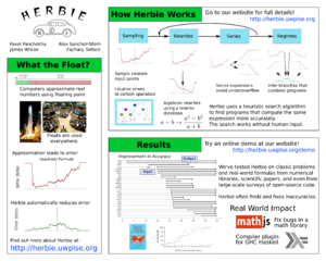
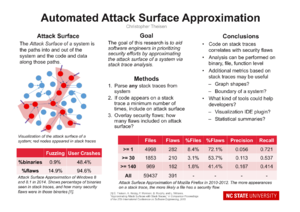
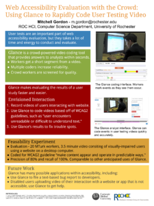
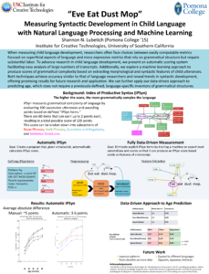
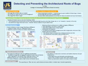
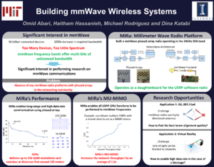
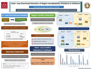
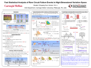
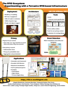
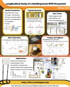
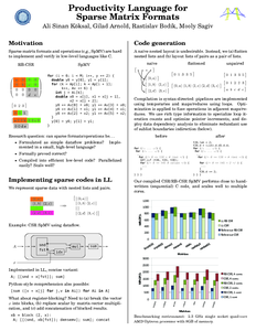
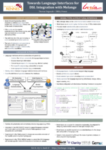
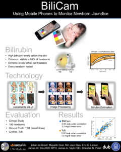
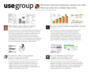
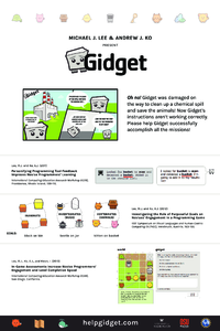
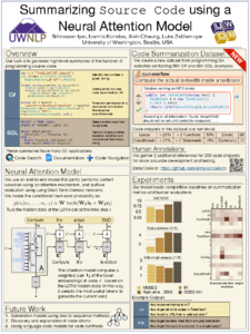
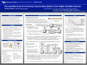
Here are some example posters, to inspire your own creativity. Click on the image to view the full-size PDF. Not all of these posters are excellent — One problem is that many of these posters or exceed the limits of how much text should be on a poster. (If you have an excellent poster that you would like to share, send me email.)
Another gallery of poster examples is maintained by Maya Cakmak.
Back to Advice compiled by Michael Ernst.
Michael Ernst