library(tidyverse)
# GGally for EDA plots (see note about base R alternative)
library(GGally)
# Just one of many options for computing the HSD post-hoc test and
# assigning group letters.
library(agricolae)
csv_url <- "https://homes.cs.washington.edu/~rjust/courses/CSEP590/hw/01_apr_analysis/data/mutation_stats.csv"
df <- read_csv(csv_url, show_col_types=F)EDA and Modeling Example
Hints for HW 1
There are many ways to analyze the HW 1 data.
At a high level, here are three possible approaches, ordered by complexity:
Two groups – multiple bivariate analyses: Compare two groups of defects in Defects4J (v1.0 vs. v1.1/2.0). (As an example, consider the difference in lines of code between the two groups.)
N groups – multiple bivariate analyses: Compare N groups of defects in Defects4J (each project is a group). (As an example, consider the difference in lines of code between the different projects.)
Multivariate analyses: Model an outcome of interest as a function of multiple explanatory variables. (As an example, consider modeling repair success as a function of code complexity, test strength, defect complexity, etc.)
Each approach has its own limitations and threats to validity. Make sure to reason about analysis validity and properly contextualize your results.
Conducting a single bivariate analysis is insufficient for HW 1: the data set is too complex to allow for meaningful conclusions by looking at only the difference of a single characteristic (code/test/bugs/etc.) between two groups (Defects4J v1.0 vs. v1.1/2.0).
Note that approach 1. above is already more complex than that: it considers multiple bivariate analyses – that is, it studies multiple characteristics in isolation. In contrast, approach 3. studies multiple characteristics in a single model.
Example Analyses
Setup
The examples below use the mutation analysis data (provided with HW 1). These examples answer different research questions, using the same data. (Think about what you can conclude from each example and what the analysis limitations are.)
Summarizing the data set
- Let’s get a first overview of the data set.
summary(df) PID BID MutantsTotal MutantsCovered
Length:824 Min. : 1.00 Min. : 1.0 Min. : 1.00
Class :character 1st Qu.: 14.00 1st Qu.: 101.8 1st Qu.: 90.75
Mode :character Median : 32.00 Median : 302.5 Median : 258.00
Mean : 45.94 Mean : 554.1 Mean : 498.96
3rd Qu.: 70.00 3rd Qu.: 624.2 3rd Qu.: 571.00
Max. :176.00 Max. :9207.0 Max. :9086.00
MutantsDetected
Min. : 0.0
1st Qu.: 63.0
Median : 179.5
Mean : 347.6
3rd Qu.: 415.2
Max. :7691.0 - For exploratory data analysis, a visual summary may be helpful.
ggpairs(df, cardinality_threshold=17)`stat_bin()` using `bins = 30`. Pick better value with `binwidth`.
`stat_bin()` using `bins = 30`. Pick better value with `binwidth`.
`stat_bin()` using `bins = 30`. Pick better value with `binwidth`.
`stat_bin()` using `bins = 30`. Pick better value with `binwidth`.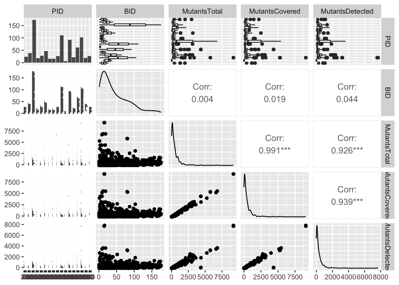
This is a GGally plot. You can also just call plot(df) (base R) to see basic counts and correlations.
This is a pretty dense plot, in particular for large data sets, but it may provide some useful insights into distributions and highly correlated variables. You can reduce complexity by selecting only columns of interest.
Minimal data wrangling
For HW 1, your data wrangling will be more involved.
Two data-wrangling steps in this example:
- (Manually) add information about the two groups of interest.
- Normalize number of mutants (think about the pros and cons of this step and why I normalized these).
d4j_old <- c("Chart", "Closure", "Lang", "Math", "Time")
df <- df |>
    mutate(Version = as.factor(ifelse(PID %in% d4j_old, "V1", "V2"))) |>
    mutate(MutCoverage = MutantsCovered/MutantsTotal) |>
    mutate(MutDetectionCov = MutantsDetected/MutantsCovered) |>
    mutate(MutDetectionAll = MutantsDetected/MutantsTotal)
summary(df)
PID BID MutantsTotal MutantsCovered
Length:824 Min. : 1.00 Min. : 1.0 Min. : 1.00
Class :character 1st Qu.: 14.00 1st Qu.: 101.8 1st Qu.: 90.75
Mode :character Median : 32.00 Median : 302.5 Median : 258.00
Mean : 45.94 Mean : 554.1 Mean : 498.96
3rd Qu.: 70.00 3rd Qu.: 624.2 3rd Qu.: 571.00
Max. :176.00 Max. :9207.0 Max. :9086.00
MutantsDetected Version MutCoverage MutDetectionCov MutDetectionAll
Min. : 0.0 V1:386 Min. :0.2255 Min. :0.0000 Min. :0.0000
1st Qu.: 63.0 V2:438 1st Qu.:0.8742 1st Qu.:0.6652 1st Qu.:0.5519
Median : 179.5 Median :0.9607 Median :0.7320 Median :0.6987
Mean : 347.6 Mean :0.9041 Mean :0.7179 Mean :0.6557
3rd Qu.: 415.2 3rd Qu.:0.9903 3rd Qu.:0.8006 3rd Qu.:0.7706
Max. :7691.0 Max. :1.0000 Max. :1.0000 Max. :1.0000 Approach 1
Note that this example is just a single bivariate analysis. It is insufficient for HW 1, and rather weak and inconclusive in general. (Think about the limitations of this single analysis and what we even could conclude at this point.)
Visualization
Three different ways of visualizing the two distributions of mutant detection rates. (A jitter plot is a point plot with some randomness applied to the x axis to avoid overlapping data points.)
ggplot(df) +
    geom_boxplot(aes(x=Version, y=MutDetectionAll, fill=Version)) +
    theme_bw() + theme(legend.position="top")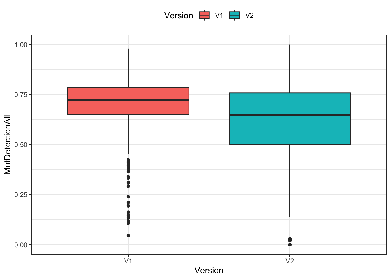
ggplot(df) +
    geom_jitter(aes(x=Version, y=MutDetectionAll, color=Version)) +
    theme_bw() + theme(legend.position="top")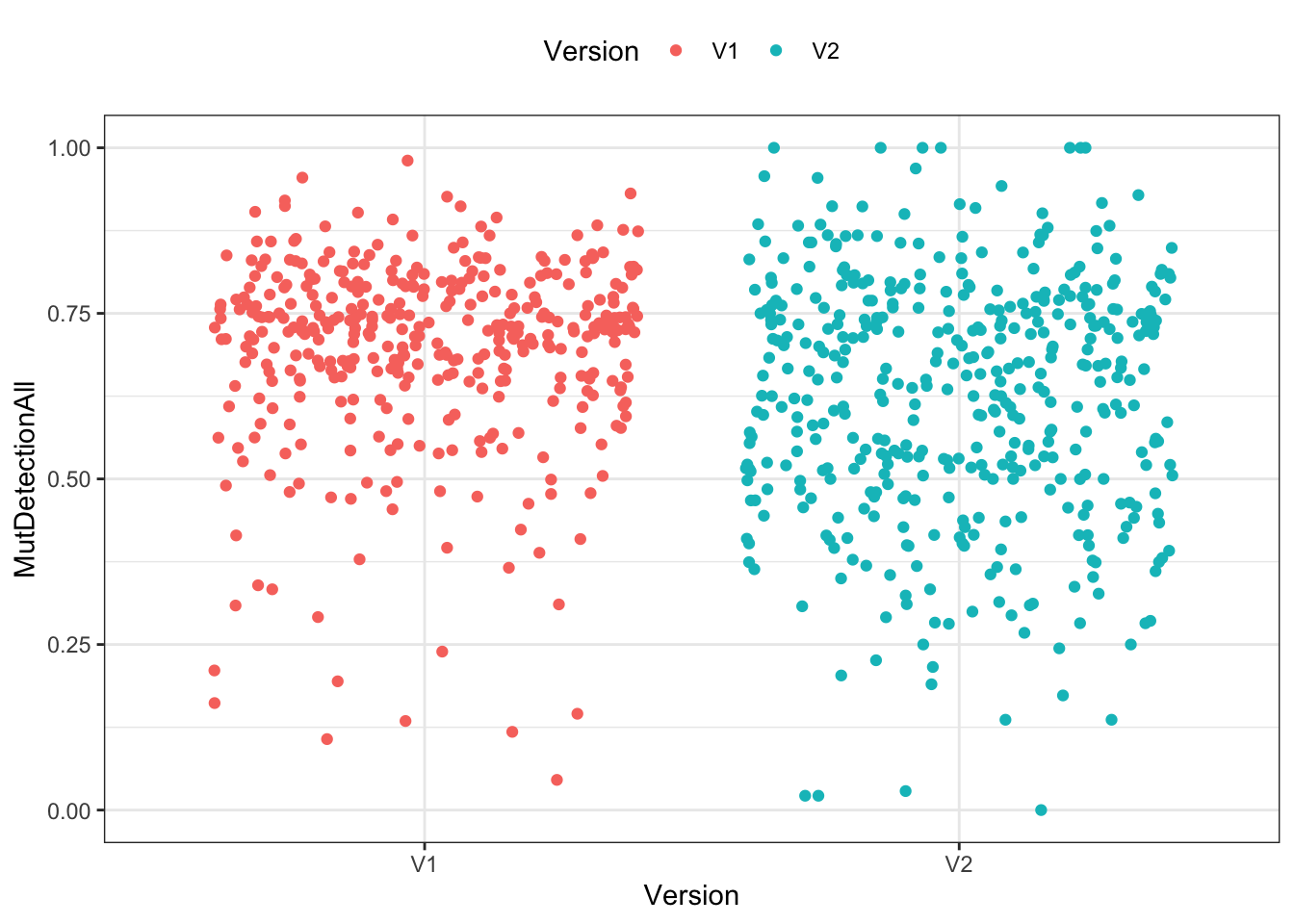
ggplot(df) +
    geom_violin(aes(x=Version, y=MutDetectionAll, fill=Version)) +
    theme_bw() + theme(legend.position="top")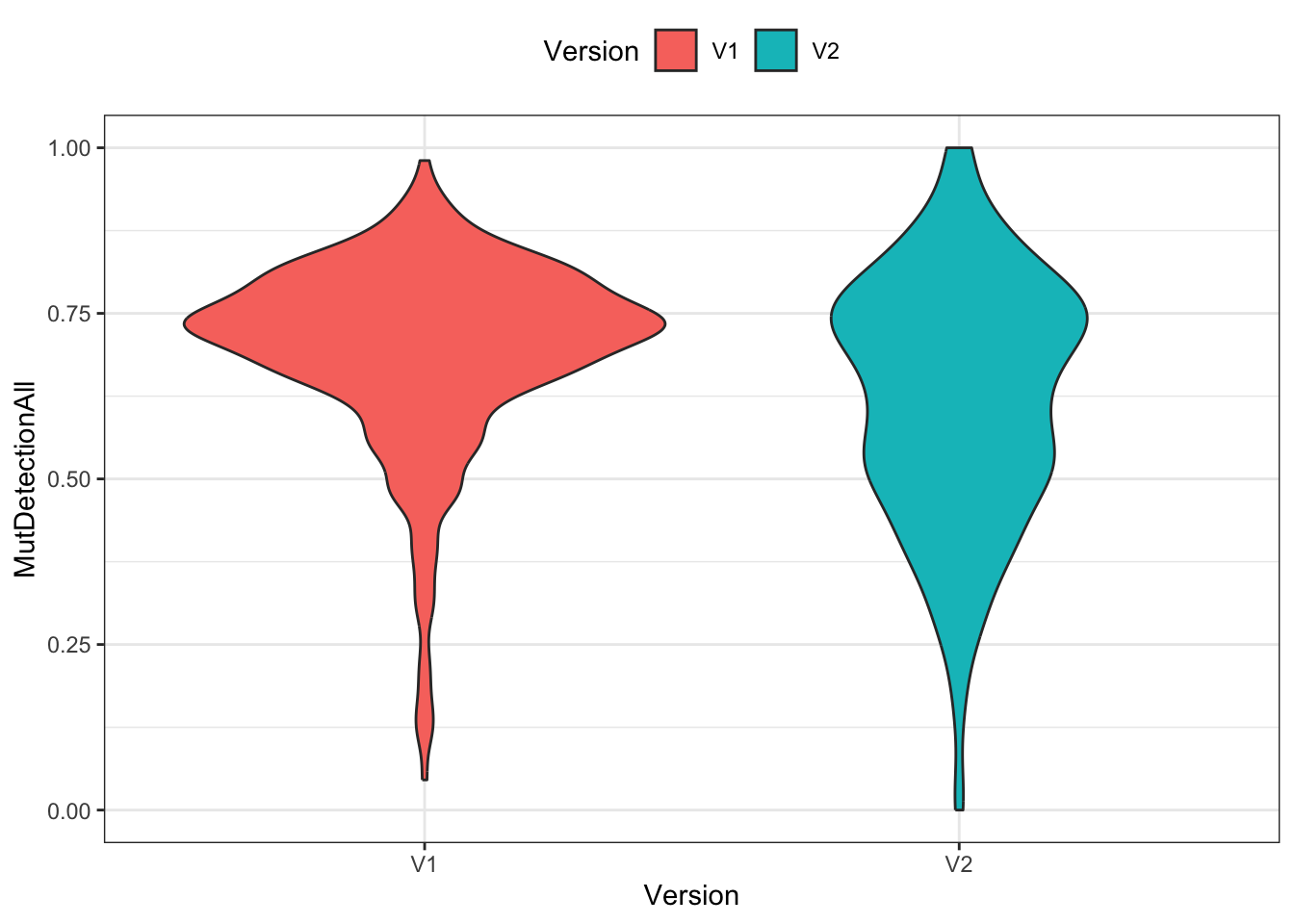
Significance testing
t.test(MutDetectionAll~Version, df)
    Welch Two Sample t-test

data:  MutDetectionAll by Version
t = 6.306, df = 807.68, p-value = 4.71e-10
alternative hypothesis: true difference in means between group V1 and group V2 is not equal to 0
95 percent confidence interval:
 0.04986176 0.09493288
sample estimates:
mean in group V1 mean in group V2
       0.6942164        0.6218191
Approach 2
Similar to approach 1, this example is just a single bivariate analysis and insufficient for HW 1. (Think about the additional information this approach is providing over approach 1, and what other analyses would be needed to complement what is shown here.)
Visualization
ggplot(df) +
    geom_violin(aes(x=reorder(PID, Version=="V1"), y=MutDetectionAll, fill=Version)) +
    xlab("PID") +
    coord_flip() +
    theme_bw() + theme(legend.position="top")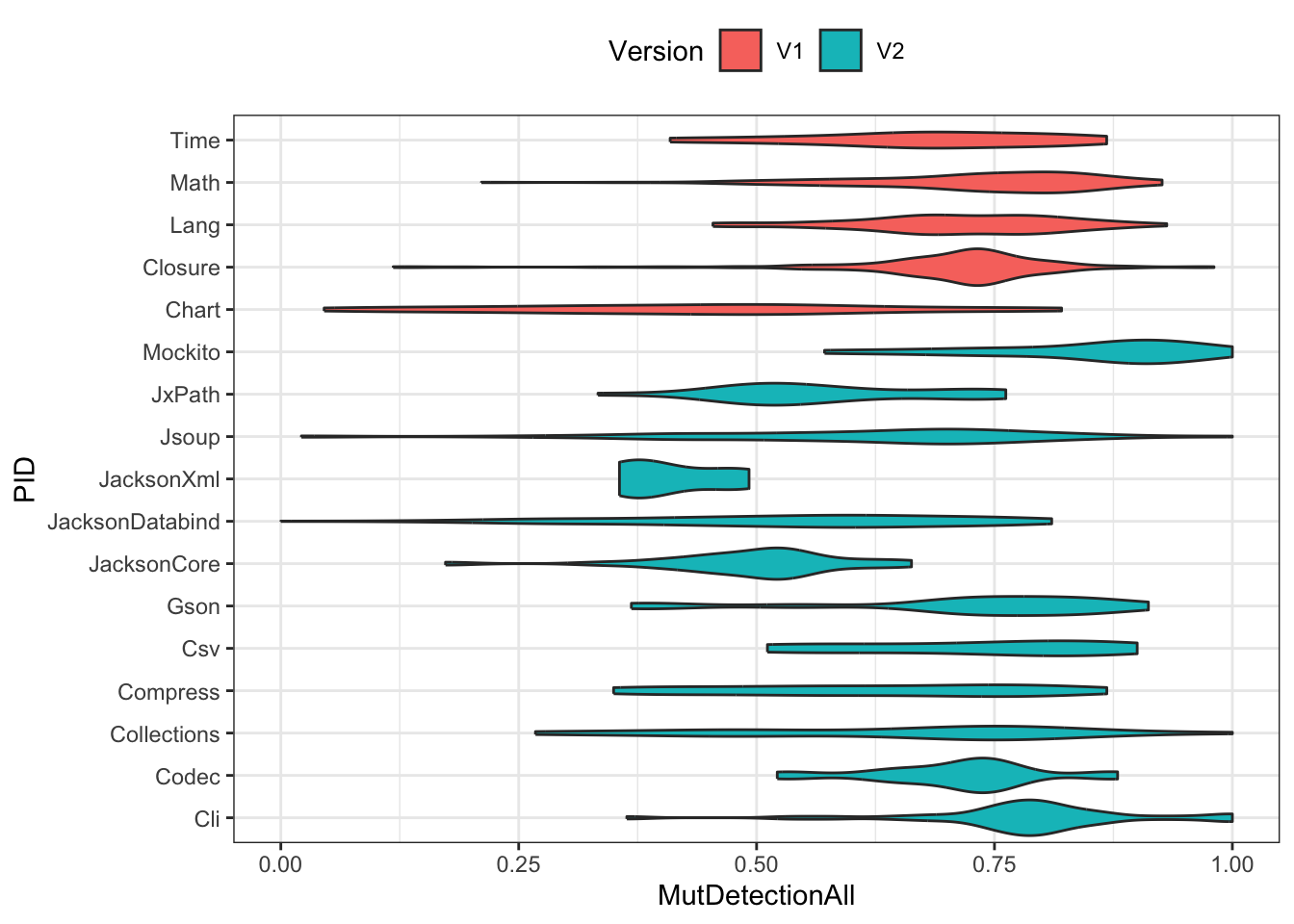
Significance testing
m <- aov(MutDetectionAll ~ PID, df)
summary(m)
Df Sum Sq Mean Sq F value Pr(>F)
PID 16 6.942 0.4339 20.48 <2e-16 ***
Residuals 807 17.094 0.0212
---
Signif. codes: 0 '***' 0.001 '**' 0.01 '*' 0.05 '.' 0.1 ' ' 1hsd <- HSD.test(m, trt="PID")
plot(hsd, horiz=T)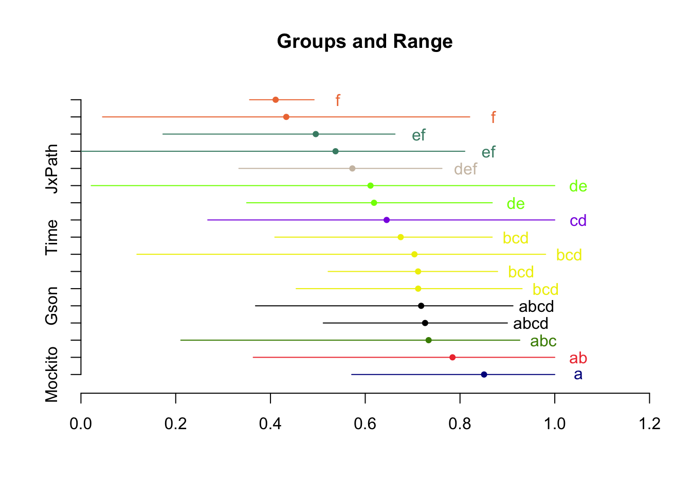
print(hsd$groups) MutDetectionAll groups
Mockito 0.8507930 a
Cli 0.7841983 ab
Math 0.7337537 abc
Csv 0.7263248 abcd
Gson 0.7179879 abcd
Lang 0.7116798 bcd
Codec 0.7115117 bcd
Closure 0.7038578 bcd
Time 0.6748234 bcd
Collections 0.6451463 cd
Compress 0.6185539 de
Jsoup 0.6110944 de
JxPath 0.5727981 def
JacksonDatabind 0.5372837 ef
JacksonCore 0.4955703 ef
Chart 0.4333080 f
JacksonXml 0.4108876 fApproach 3
Note that this example is not necessarily a useful model for HW 1. Rather, it is intended to show some basic modeling steps.
Model 1
t.test(MutDetectionAll ~ Version, df)
    Welch Two Sample t-test

data:  MutDetectionAll by Version
t = 6.306, df = 807.68, p-value = 4.71e-10
alternative hypothesis: true difference in means between group V1 and group V2 is not equal to 0
95 percent confidence interval:
 0.04986176 0.09493288
sample estimates:
mean in group V1 mean in group V2
       0.6942164        0.6218191
m <- lm(MutDetectionAll ~ Version, df)
summary(m)
Call:
lm(formula = MutDetectionAll ~ Version, data = df)

Residuals:
     Min       1Q   Median       3Q      Max
-0.64866 -0.09157  0.02874  0.11425  0.37818

Coefficients:
             Estimate Std. Error t value Pr(>|t|)
(Intercept)  0.694216   0.008507  81.607  < 2e-16 ***
VersionV2   -0.072397   0.011668  -6.205 8.68e-10 ***
---
Signif. codes:  0 '***' 0.001 '**' 0.01 '*' 0.05 '.' 0.1 ' ' 1

Residual standard error: 0.1671 on 822 degrees of freedom
Multiple R-squared:  0.04474,   Adjusted R-squared:  0.04358
F-statistic: 38.5 on 1 and 822 DF, p-value: 8.675e-10plot(m, which=1)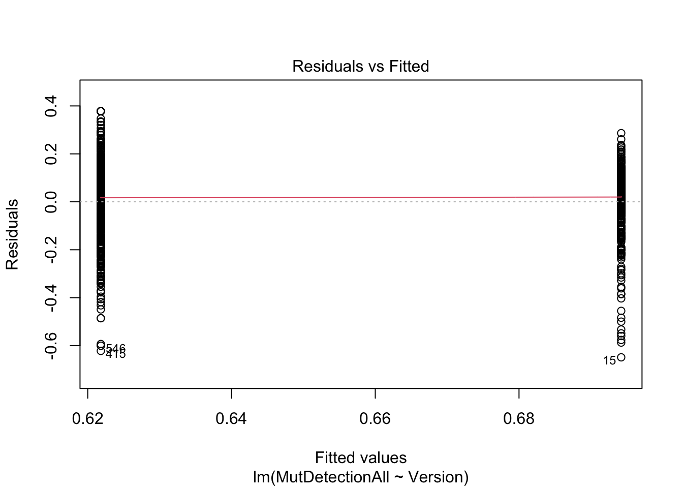
Note how the t test and lm provide the same information. (The intercept in the linear model is the average MutDetectionAll for V1.)
Read the fitted lm model as: Predict MutDetectionAll from Version, where the latter is dummy (one-hot) encoded: 0=V1, 1=V2. Since there is no other information in the model, the best it can do is predict the average for each group.
Model 2
m <- lm(MutDetectionAll ~ MutCoverage + Version, df)
summary(m)
Call:
lm(formula = MutDetectionAll ~ MutCoverage + Version, data = df)

Residuals:
     Min       1Q   Median       3Q      Max
-0.74405 -0.04461  0.00393  0.06348  0.25595

Coefficients:
             Estimate Std. Error t value Pr(>|t|)
(Intercept) -0.236258   0.028734  -8.222 7.78e-16 ***
MutCoverage  0.995630   0.030161  33.010  < 2e-16 ***
VersionV2   -0.015319   0.007846  -1.953   0.0512 .
---
Signif. codes:  0 '***' 0.001 '**' 0.01 '*' 0.05 '.' 0.1 ' ' 1

Residual standard error: 0.1096 on 821 degrees of freedom
Multiple R-squared:  0.5895,    Adjusted R-squared:  0.5885
F-statistic: 589.6 on 2 and 821 DF, p-value: < 2.2e-16plot(m, which=1)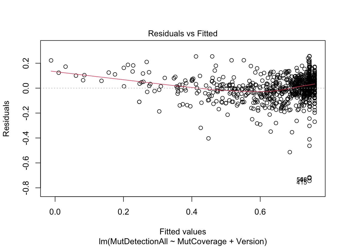
Note how Version is a rather insignificant predictor in this model. (It does not explain much variance in MutDetectionAll beyond what is explained by MutCoverage.
Also note that MutDetectionAll and MutCoverage must show this strong relationship. (Think about why this is true.)
Model 3
m <- lm(MutDetectionCov ~ MutCoverage + MutantsTotal + PID, df)
summary(m)
Call:
lm(formula = MutDetectionCov ~ MutCoverage + MutantsTotal + PID,
    data = df)

Residuals:
     Min       1Q   Median       3Q      Max
-0.69711 -0.04826  0.01032  0.06131  0.41756

Coefficients:
                     Estimate Std. Error t value Pr(>|t|)
(Intercept)         3.795e-01  3.539e-02  10.723  < 2e-16 ***
MutCoverage         2.564e-01  3.491e-02   7.344 5.07e-13 ***
MutantsTotal       -1.645e-05  4.808e-06  -3.421 0.000655 ***
PIDCli              1.972e-01  3.064e-02   6.437 2.09e-10 ***
PIDClosure          1.300e-01  2.587e-02   5.026 6.16e-07 ***
PIDCodec            1.118e-01  3.662e-02   3.052 0.002345 **
PIDCollections      1.372e-01  3.221e-02   4.259 2.30e-05 ***
PIDCompress         8.616e-02  2.919e-02   2.952 0.003252 **
PIDCsv              1.493e-01  3.766e-02   3.963 8.06e-05 ***
PIDGson             1.815e-01  3.817e-02   4.754 2.36e-06 ***
PIDJacksonCore      7.188e-02  3.317e-02   2.167 0.030533 *
PIDJacksonDatabind  6.143e-02  2.602e-02   2.361 0.018459 *
PIDJacksonXml       6.120e-02  5.249e-02   1.166 0.243941
PIDJsoup            8.252e-02  2.675e-02   3.085 0.002109 **
PIDJxPath           9.110e-02  3.405e-02   2.676 0.007607 **
PIDLang             1.306e-01  2.859e-02   4.569 5.66e-06 ***
PIDMath             1.595e-01  2.698e-02   5.912 5.00e-09 ***
PIDMockito          2.260e-01  3.629e-02   6.229 7.54e-10 ***
PIDTime             1.174e-01  3.304e-02   3.554 0.000402 ***
---
Signif. codes:  0 '***' 0.001 '**' 0.01 '*' 0.05 '.' 0.1 ' ' 1

Residual standard error: 0.1148 on 805 degrees of freedom
Multiple R-squared:  0.264, Adjusted R-squared:  0.2475
F-statistic: 16.04 on 18 and 805 DF, p-value: < 2.2e-16plot(m, which=1)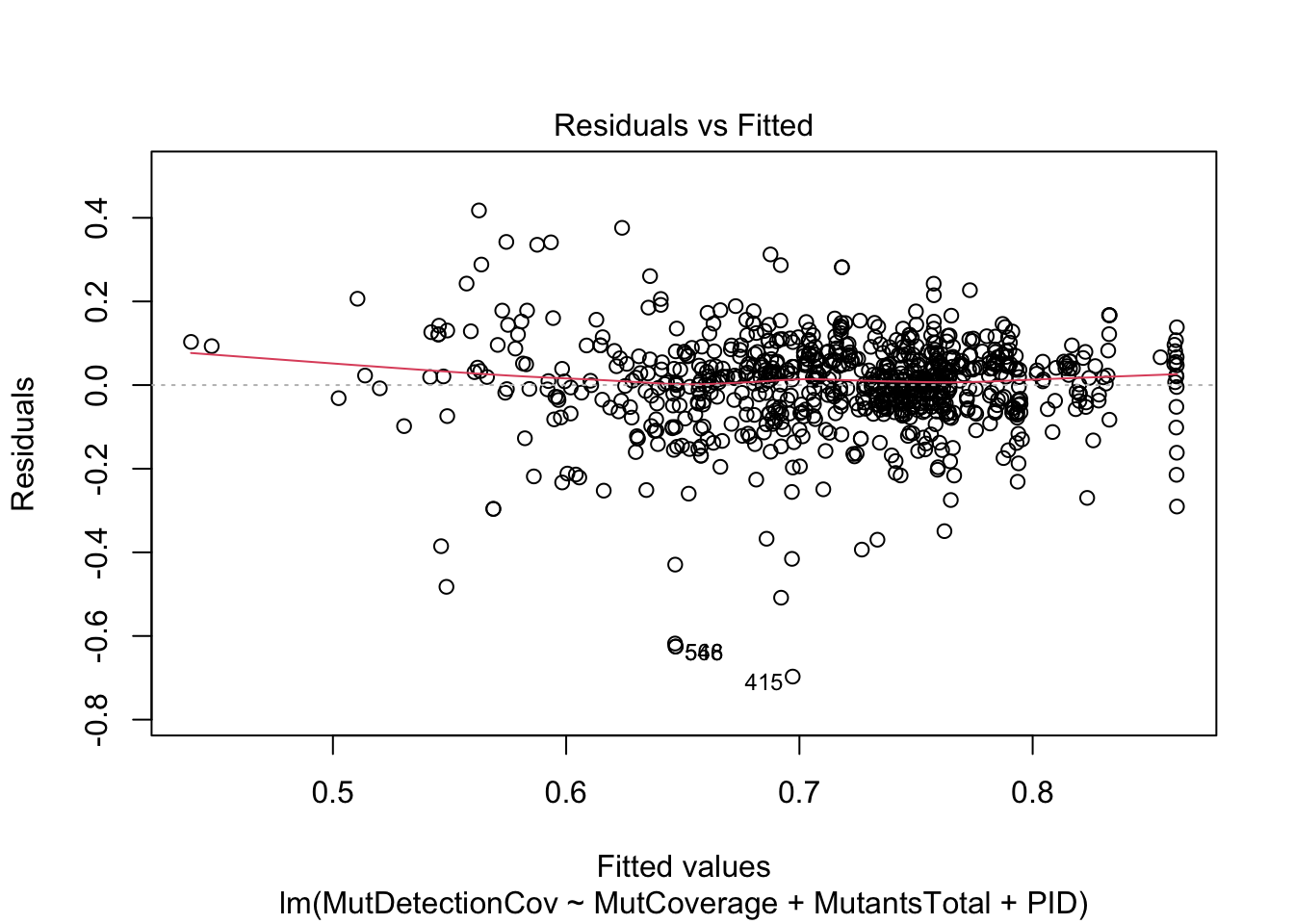
This model is more meaningful than the previous one. Think about why this is the case and how to interpret the overall result – at a high level, what question is this model answering?
Model 4
ggplot(df, aes(x=MutCoverage, y=MutDetectionCov)) +
    geom_point() +
    geom_smooth(method="lm", formula="y~x")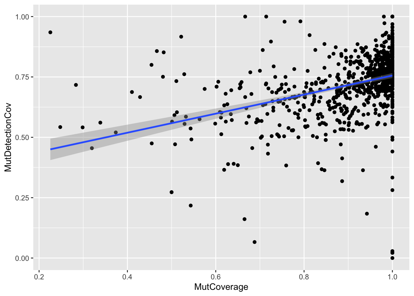
ggplot(df, aes(x=MutCoverage, y=MutDetectionCov, color=PID)) +
    geom_point() +
    geom_smooth(method="lm", formula="y~x", color="black") +
    facet_wrap(PID~.) +
    theme_bw() + theme(legend.position="none")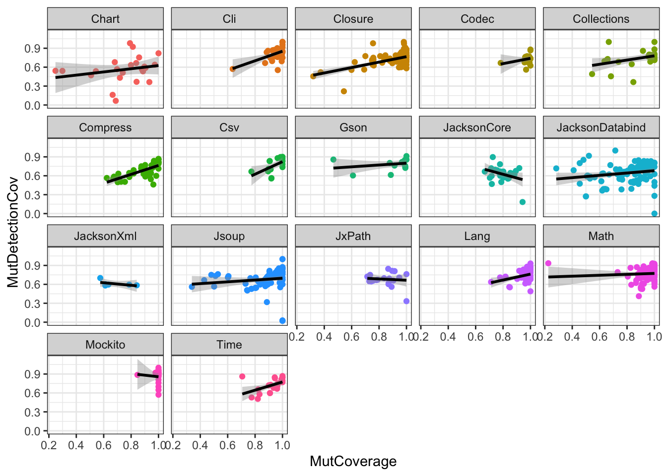
Note how the visual representation of the two different models shows that we would have missed the fact that the relationship between the two variables is not the same across the PIDs (had we ignored potential differences across PIDs).