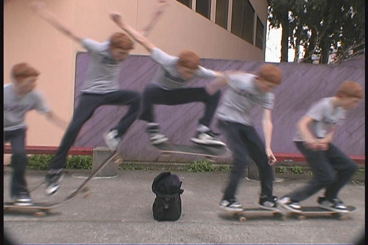
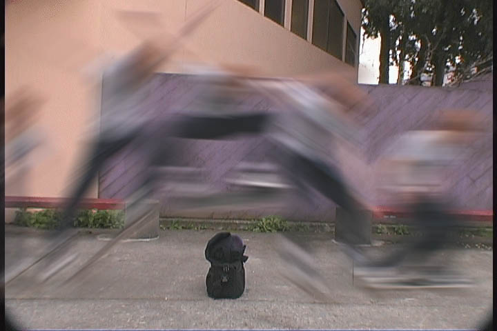
In addition, we demonstrate more
abstract uses of motion blur. In this sequence (originally visualized in
), instead of forming motion tails,
alternating frames are blurred. This was inspired by examples of the
diagrammatic elements used in traditional comics (
), and while it clearly has less of a basis in reality than
"motion tails," viewers still found the effect interesting and
informative.
This same technique can be applied to the comic visualizations presented in
the last section.
Figure 21 shows an example of
this, using the same dance sequence as before. This is much harder
than the skating example, since different parts of the body move in
completely different directions, and hence must be blurred separately.
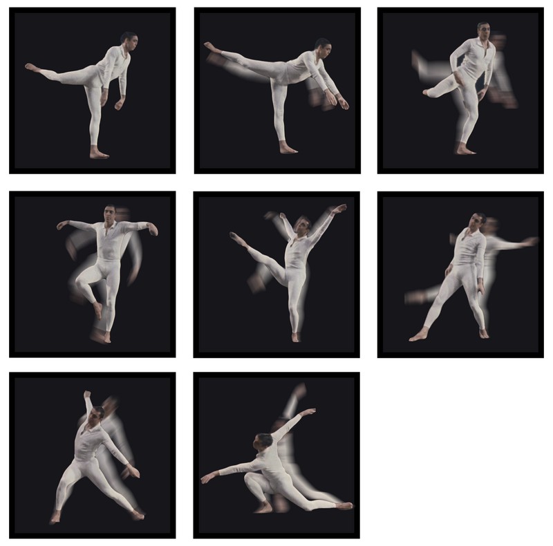 Figure 21
: Motion blur lines.
Video
Motion Lines
While motion blur is an intuitive way to describe movement, it has its
drawbacks: it takes up quite a bit of screen real estate and loses
much of the information present in the original image. Our "motion
tails" approach, mixing motion blur with static strobe images, helps
with these issues, but doesn't solve them entirely. An alternate
approach is to study the language of motion developed by comic book
artists (
Figure 5), who have been
struggling with many of these issues for decades.
The most common diagramatic element found in comics is the "motion
line," a line that traces a point in space throughout the duration of
the action. In many cases, this is a simplified form of motion blur,
with lines streaking behind the moving object. At the same time,
motion lines have many degrees of freedom that can be mapped to qualities of the motion: length,
width, frequency, color, opacity, etc. In the following examples, we
explore a small subset of this space to demonstrate the power of these
techniques, which would all be impossible to create with traditional
photography.
In our first example (
Figure 22), we add
diagrammatic arrows to the visualization depicted in
Figure 15. These arrows were
added using Adobe Illustrator. We felt this example could
especially benefit from motion lines, since the paths of the dancer's movements were
not always clear. The motion lines help clear up this
ambiguity. The lines start at the last position of the arms in the previous
sprite, and sweep to their new position. Different colors were
used for the two arms. Finally, a third color was used to
indicate whole body rotation at the end.
 Figure 22
: Arrow motion lines.
Video
Though these lines do add useful
information, we found it difficult to create aesthetically pleasing
results using Illustrator. To help us create the rest of the
examples in the section, we developed a small interactive tool for
drawing smooth motion lines and compositing them into the scene.
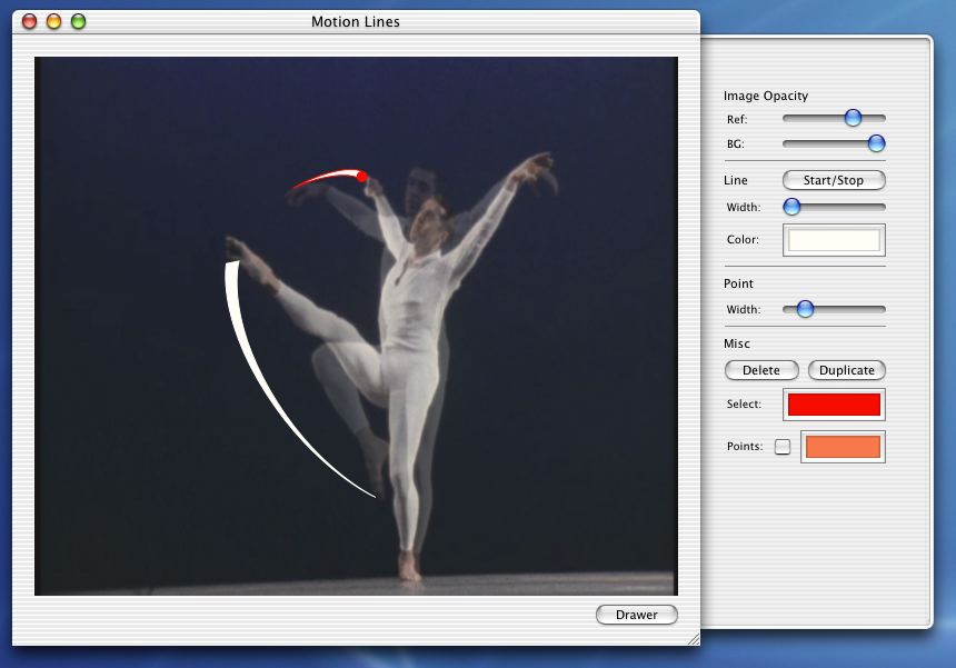 Figure 23
: Generate motion
lines using video frames as reference
The application lets you load two images, a reference and a background
images, and adjust their opacities to view a blend of the two. The
user can then draw Bezier paths from a point on one image to the same
point on the other. Once the basic path is drawn, the user adjusts
the width at each control point along with the color/opacity of the
overall line, to create the desired effect. Once all the paths have
been drawn, the motion lines can be exported to transparent TIFF
files, which can then be composited in Photoshop into the final visualization.
A first example of motion lines creating using this tool is shown in
Figure 24; these motion lines are on top of the
visualization shown in
Figure 17.
They help to disambiguate many of the motions, and to give a
better sense of the flow. The lines start very thin and
end wider, conveying the direction of motion without the ugly weight of
arrowheads.
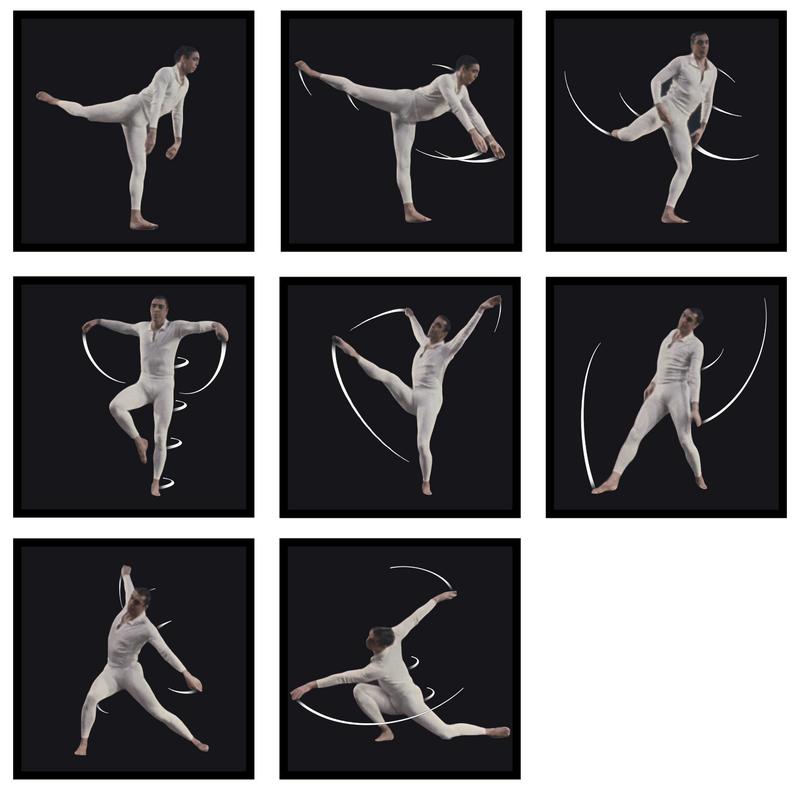 Figure 24
: Motion line comic
strip visualization.
Video
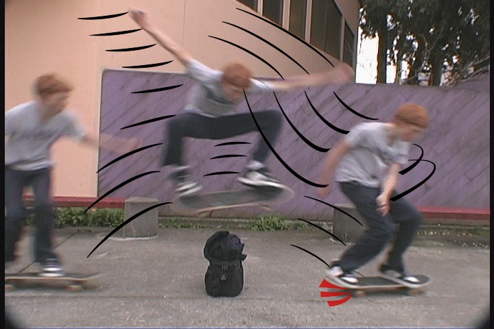
In the following visualization (
Figure 25), motions lines are used with strobing
as an alternate way to depict the
skateboard sequence.
Along with standard motion lines, red lines where the skateboard hit
the ground add another comic strip effect.
 Figure 25
: Strobing with motion
lines visualization.
Video
Interestingly, our viewer feedback suggests that motion lines affect
the above visualizations differently. In the dance sequence,
Figure 24 was widely considered to be the best
visualization among the methods presented, both in terms of
aesthetics and conveying the true motion. The skateboard
sequence, on the other hand, was deemed better visualized through
motion blur. This is probably partly due to the simplicity of
the action, the motion lines did not convey any new information.
But that is not all: one viewer remarked that he "didn't trust" the
lines in the skateboard sequence - they were "too graceful." "I expect a
dancer to be graceful, but for a skater, it just makes it seem like a
cartoon." This suggests that some sequences might be more suited
to the technique than others. More exploration into how the smoothness of motion lines
affect the efficacy of the visualization could be useful.
Motion lines and other diagramatic elements provide a huge toolbox
with which to describe human motion. In the
strobing section, we discussed the
problems that arise with image overlap, and in many cases these
disappear when using motion lines. Consider the following
visualization of sequence from a Buster Keaton
film.
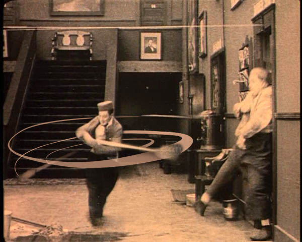 Figure 26
: Visualizing a swing
using motion lines.
Video
Note that the motion line is not restricted to being a "tail," it
spans the entire length of action. Using this diagrammatic
framework, the entire action is summarized by a single pose image,
providing a cleaner visualization than strobing or comics could
generate by themselves.
NEXT: Conclusion and Future Work
