
Current Projects
Benchmarking Visualization Recommendation Systems
As data continues to grow at unprecedented rates, we encounter unique challenges in helping analysts make sense of it. For example, an analyst may have to reduce thousands of data columns and billions of data records down to a single visualization. With each step of this design process, the analyst must grapple with what parts of the data to focus on and how to translate this focus into a compelling image. How can visualization tools help analysts navigate the complex visualization design space?
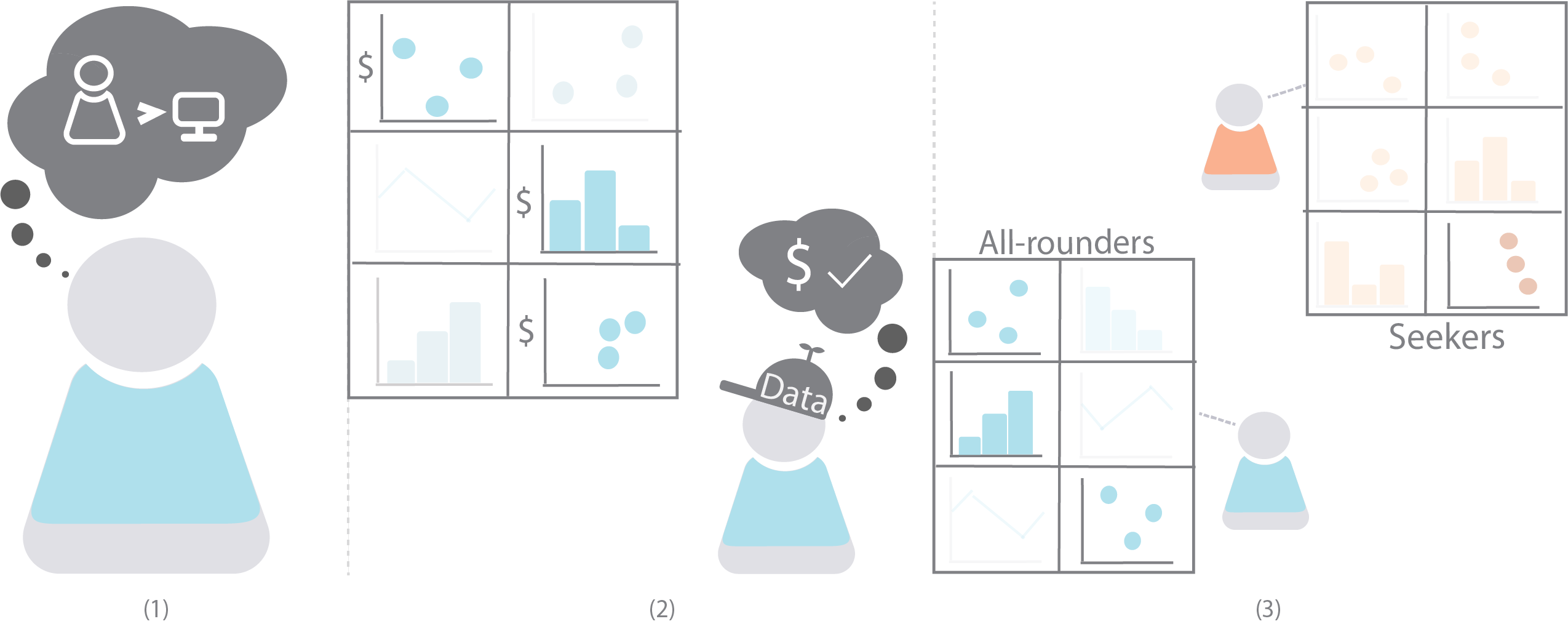
We have seen an explosion of visualization recommendation systems responding to this challenge. These systems aim to reduce decision fatigue by automating part or even all of the visualization design process. However, little work has been done to understand whether users trust these automated recommendations and what factors may influence the efficacy of visualization recommendations. By characterizing why and how people use recommendations, my research deepens our understanding of their role in data exploration and enables us to benchmark them according to how useful they are to analysts in the real world.
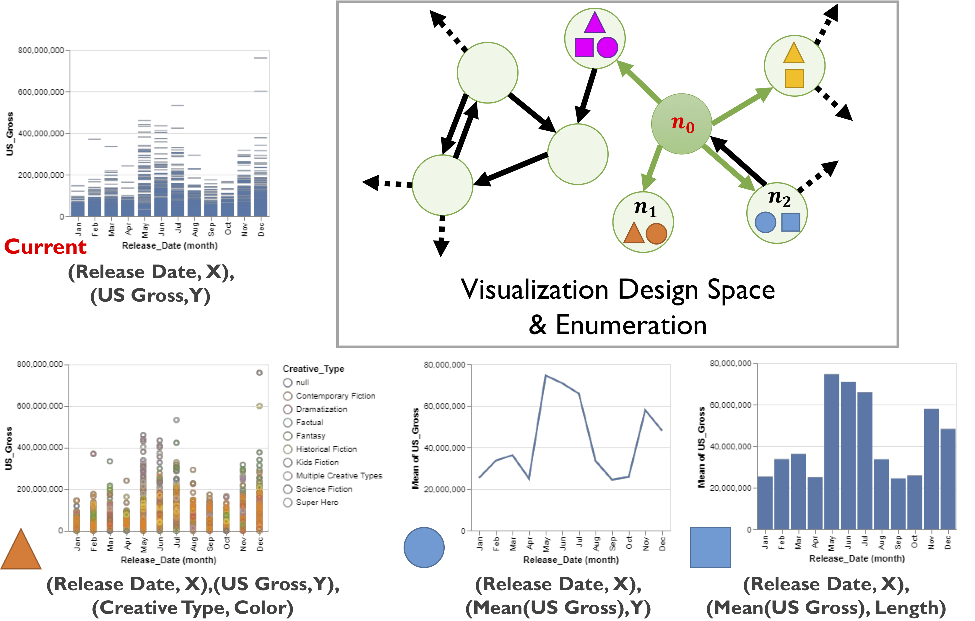
For examples, check out our CHI '22 paper on comparing how experts recommend visualizations to how algorithms generate recommendations, CHI '21 paper on assing user trust in visualization recommendations, and our Honorable Mention VIS '21 paper on benchmarking visualization recommendation algorithms by complexity and utility.
Behavior-Driven Benchmarking of Database Systems for Data Exploration
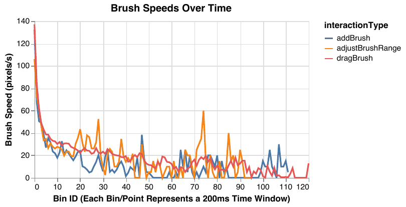
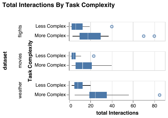
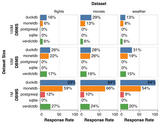
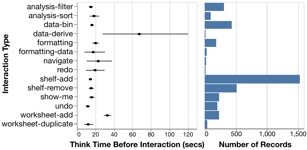
I led a large interdisciplinary research team to derive new database benchmarks from real logs of users manipulating dynamic query interfaces, which display live updates as interactions are performed in real time (presented at SIGMOD 2020). Our approach merges new visualization theory on exploratory visual analysis (or EVA) and benchmarking methodology from databases. We carefully designed an exploratory user study with representative EVA tasks, datasets, and users, producing 128 separate session logs. We analyzed these logs to characterize the observed interaction patterns, and based on our analysis, highlighted design implications for database systems to support highly interactive visualization use cases. For example, our results show that when given the option to utilize real-time querying, users take advantage of it to perform long, continuous interactions that generate hundreds of queries per second. Finally, we developed a full end-to-end pipeline for translating our interaction logs to database queries, and evaluated our benchmark on five different database systems. Our results show that current database systems still have work to do to support real-time exploration scenarios!
In ongoing research, we are generalizing the ideas behind our previous benchmark to simulate users accomplishing well-known data exploration tasks for any dashboard design consisting of standard visualization and interaction components. Our ongoing work can be found here.
Supporting Rapid Visualization Prototyping With D3
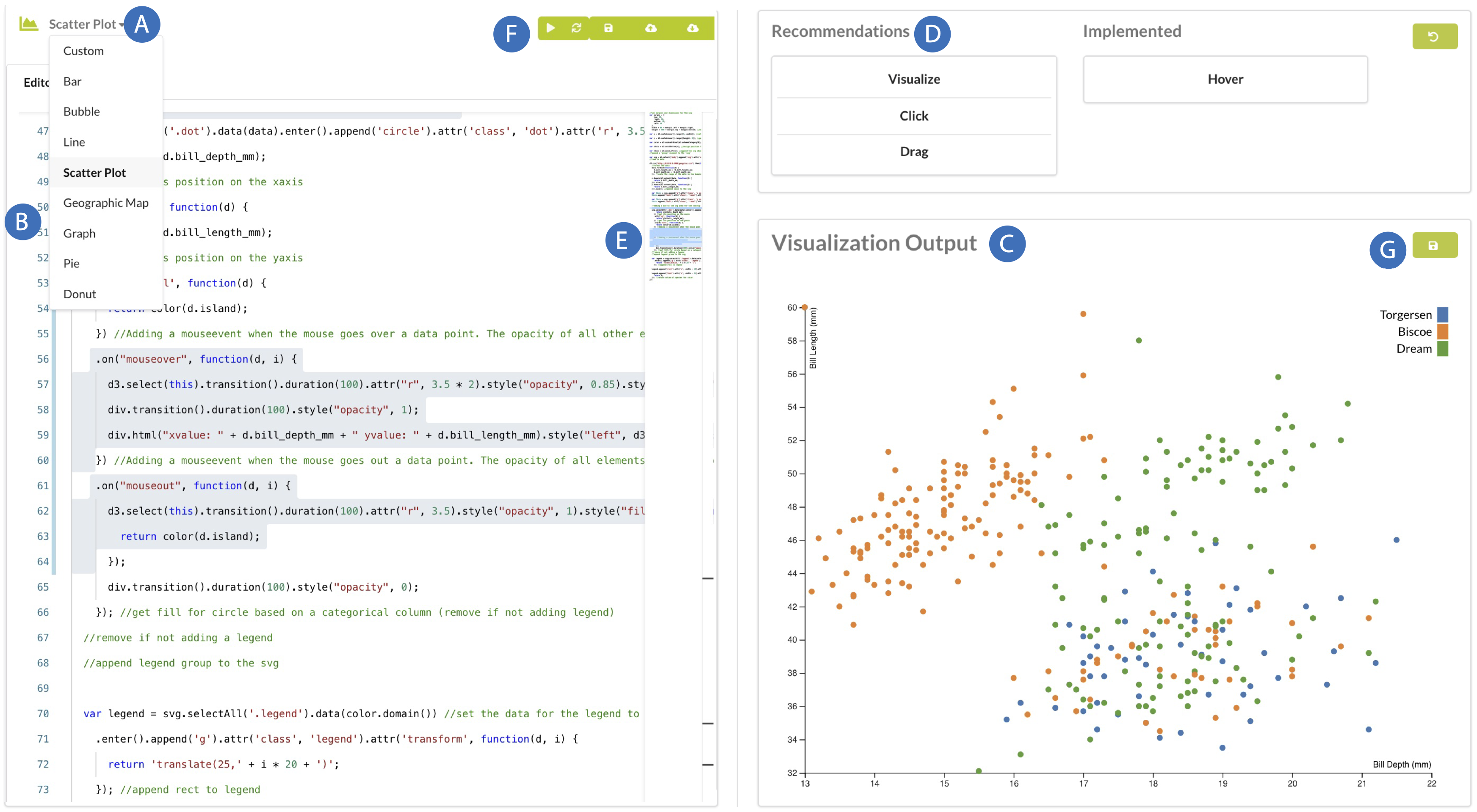
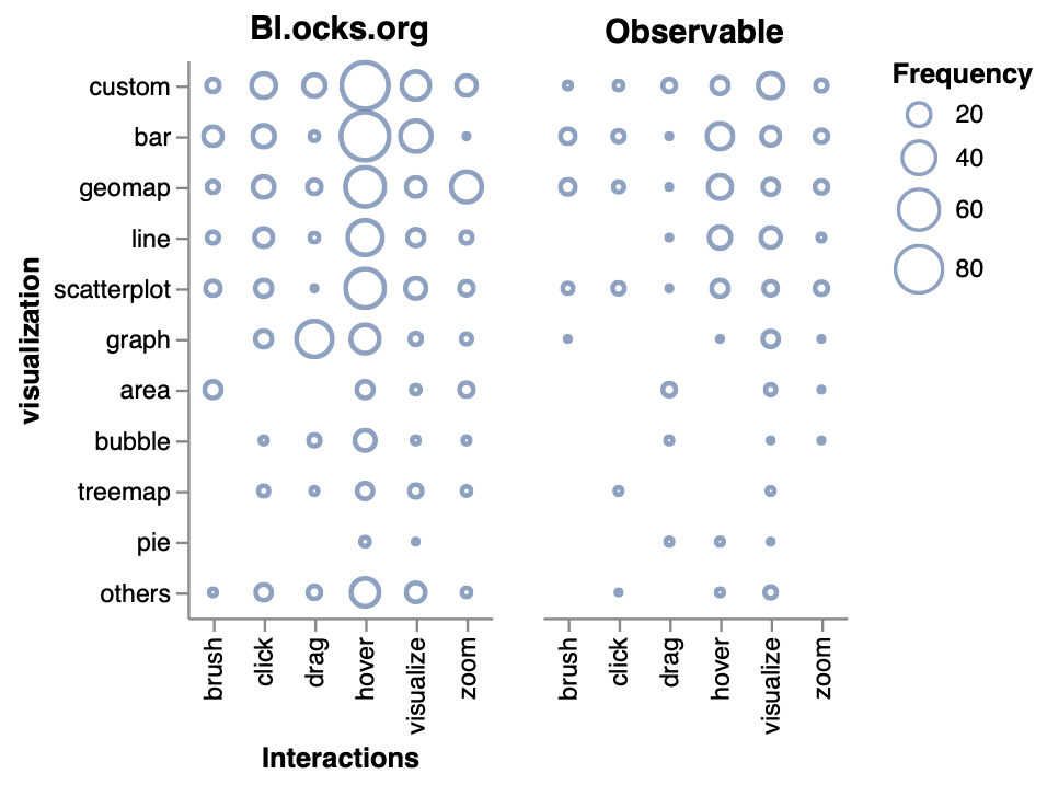
Automated recommendations speed up exploration by reducing the user’s design choices but this strategy often clashes with user agency and creative control. How can we help users prototype different visualization programs while preserving their creative flow? We blend methodology from design and software engineering with machine learning applications to provide customized prototyping support for visualization (specifically, D3) users. Through this work, we have also opened up a new research sub-area in analyzing online communities (e.g., GitHub, Stack Overflow, etc.) to evaluate data science tools and received a VIS Best Short Paper award for our research. Check out our IUI '23 paper, our VIS '22 paper, our VIS '22 short papers (here and here), and our CHI '18 paper for more details.
Collating Graphical Perception for Visualization Recommendation
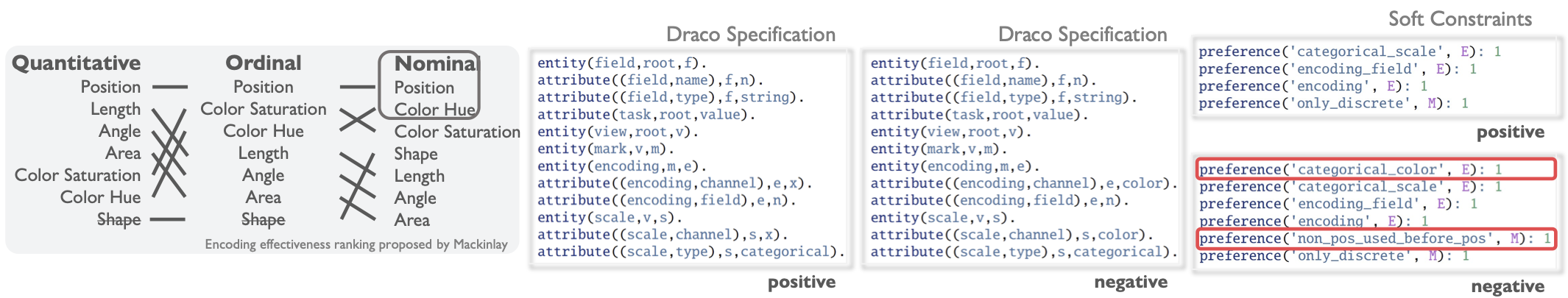
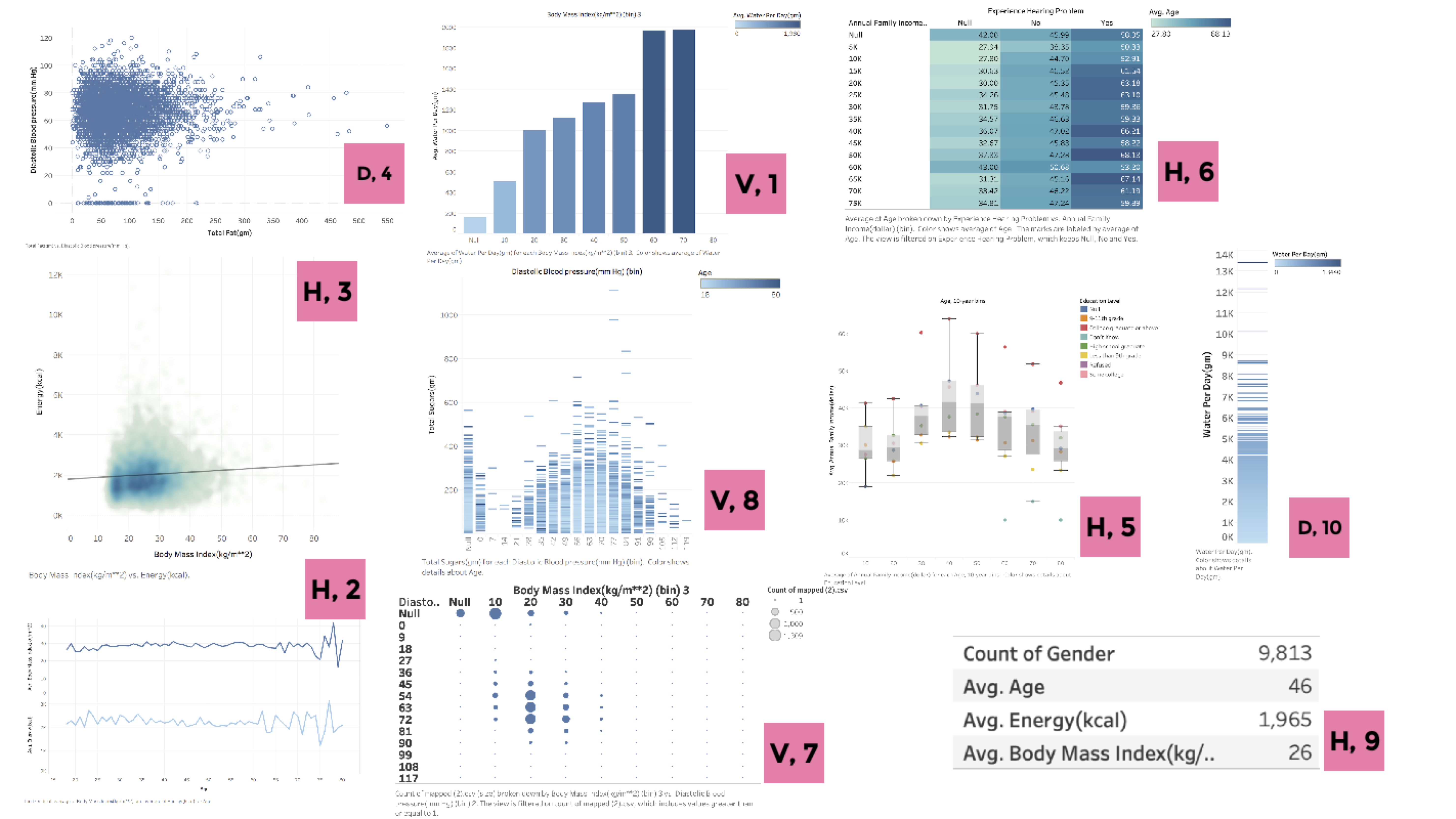
One possible optimization strategy for visualization recommendation systems is to incorporate a richer understanding of user context within the recommendation process. For example, a person's interpretation of visualizations depends directly on their ability to perceive the corresponding images. Thus, graphical perception research could provide useful guidelines for generating customized visualization for certain user groups. However, relatively few systems utilize these guidelines, limiting our understanding of how graphical perception may influence generated recommendations. We have created a JSON-formatted dataset that collates existing theoretical and experimental results in graphical perception (see our CHI '23 paper for details). This dataset is the first of its kind to provide significant quantitative graphical perception data (i.e., data from 59 different graphical perception studies) that could be imported directly into visualization recommendation systems.
In ongoing research, we are investigating how these data can be used to model graphical perception results in Draco---a framework for modeling visualization design knowledge---to inform the design of new visualization recommendation algorithms. Broadly, our research reveals a new research sub-area that could generate mutually reinforcing advancements between graphical perception and visualization recommendation research. For example, Draco can act as a useful normalizer for comparing different results in graphical perception, enabling us to identify which perceptual guidelines may provide the biggest boosts in recommendation performance, which topics may be over- or understudied (i.e., have sufficient consensus in the literature). In the opposite direction, our Draco-based pipeline provides a means to automatically update visualization recommendation systems in response to study results in graphical perception.
Past Projects
Characterizing Exploratory Visual Analysis
Our database benchmarks are also based on my research in understanding the role of exploratory visual analysis in data science. Supporting exploratory visual analysis (EVA) is a central goal of visualization research, and yet our understanding of the process is arguably vague and piecemeal. My research contributes a consistent definition of EVA through review of the relevant literature, and an empirical evaluation of existing assumptions regarding how analysts perform EVA using Tableau, a popular visual analysis tool. We find striking differences between existing assumptions and the collected data through a study with 27 Tableau users exploring three different datasets. Participants successfully completed a variety of tasks, with over 80% accuracy across focused tasks with measurably correct answers. The observed cadence of analyses is surprisingly slow compared to popular assumptions from the database community. We find significant overlap in analyses across participants, showing that EVA behaviors can be predictable. Furthermore, we find few structural differences between behavior graphs for open-ended and more focused exploration tasks. This research was presented at EuroVis 2019.
Understanding User Queries for Optimization
I developed three visualization systems that exploit knowledge of how users visually explore datasets to implement context-aware database optimizations. ScalaR dynamically adjusts the size of query results output from a DBMS, based on the available screen space to render the results, avoiding rendering issues such as over- plotting. ForeCache uses predictive prefetching techniques to support large-scale 2D data browsing. Sculpin combines predictive pre-fetching, incremental pre-computation, and visualization-aware caching techniques to support interactive visualization of queries executed on large, multidimensional array data. We collaborated with scientists to design and evaluate these systems when exploring satellite sensor data from the NASA MODIS.
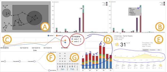
StreamTrace: Making Sense of Temporal Queries with Interactive Visualization
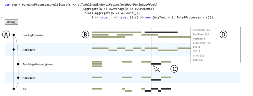
As real-time monitoring and analysis become increasingly important, researchers and developers turn to data stream management systems (DSMS's) for fast, efficient ways to pose temporal queries over their datasets. However, these systems are inherently complex, and even database experts find it difficult to understand the behavior of DSMS queries. To help analysts better understand these temporal queries, we developed StreamTrace, an interactive visualization tool that breaks down how a temporal query processes a given dataset, step-by-step. The design of StreamTrace is based on input from expert DSMS users; we evaluated the system with a lab study of programmers who were new to streaming queries. Results from the study demonstrate that StreamTrace can help users to verify that queries behave as expected and to isolate the regions of a query that may be causing unexpected results. This project was completed during my internship at Microsoft Research in 2014, and was presented at the CHI 2016 conference.